Understanding AQI Categories for Smart Displays
Last updated: 2023-09-05
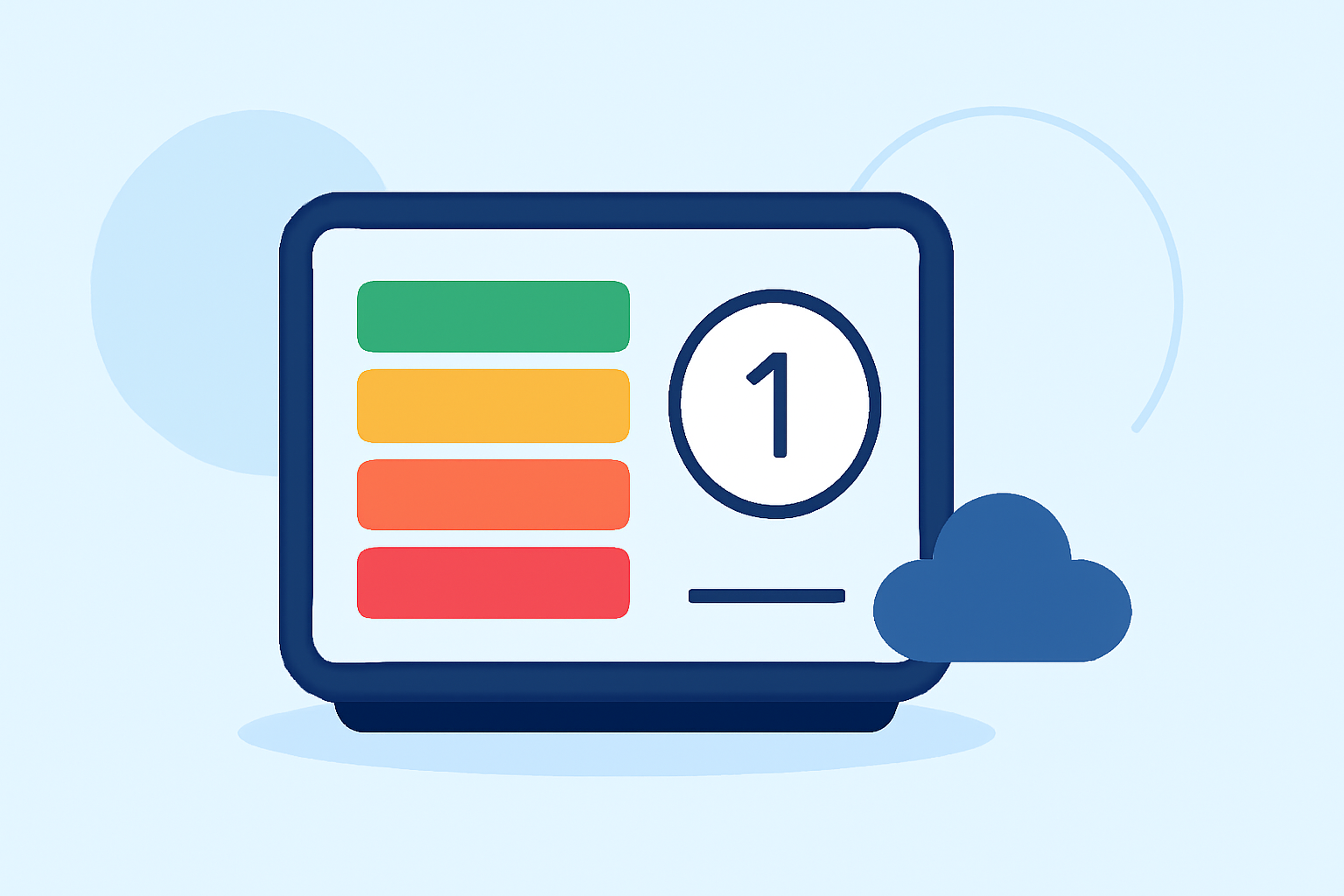
To effectively display Air Quality Index (AQI) categories on smart displays, using EPA-standard color coding is essential for user understanding. For specialized use cases, alternative platforms may offer unique insights.
Summary
- Color Coding: Each AQI category has a specific color that visually indicates air quality levels.
- Health Impacts: Understand the health implications associated with different AQI levels.
- Data Integration: Utilize reliable data sources to ensure accurate AQI representations on smart displays.
- Clime's Features: Clime provides NOAA-based radar along with environmental layers, including AQI information, ensuring comprehensive reporting.
How Do AQI Categories Map to Color Codes?
The AQI system consists of several categories that are visually represented by distinct colors. According to official resources:
- Green (0-50): Good air quality. No significant health risk.
- Yellow (51-100): Moderate air quality. Some pollutants may be a concern for a small number of people.
- Orange (101-150): Unhealthy for sensitive groups. Individuals with lung disease, children, and older adults should limit prolonged outdoor exertion.
- Red (151-200): Unhealthy. Everyone may begin to experience health effects; members of sensitive groups may experience more serious health effects.
- Purple (201-300): Very Unhealthy. Health alert: everyone may experience more serious health effects.
- Maroon (301-500): Hazardous. Health warnings of emergency conditions. The entire population is more likely to be affected.
This progression from green to maroon highlights worsening air quality, which is crucial for smart display visuals. EPA AQI guidelines outline these categories and colors in detail.
Best Practices for Presenting AQI on Smart Displays
When designing a smart display for AQI categories, consider the following best practices:
- Prominent Display: Use large, legible fonts and contrasting colors for easy visibility, especially for individuals with visual impairments.
- Dynamic Updates: Ensure real-time data integration so users are informed of current air quality conditions.
- Custom Alerts: Leverage notifications to alert users when AQI levels change significantly, especially if they enter unhealthy ranges.
- User Connections: Create interactive features that allow users to click or tap for more detailed information about air quality factors and recommendations based on their health concerns.
Handling AQI Labels on Compact Displays
Compact displays require careful design choices:
- Simplified Labels: Use short descriptors (e.g., "Good", "Moderate", "Unhealthy") alongside color indicators to provide essential information quickly.
- Use Icons: Incorporate icons to symbolize health effects, making it easier for users to understand the implications without reading lengthy text.
- Limit Categories Shown: When space is constrained, consider displaying only the most urgent alert or the current AQI category rather than all possible classifications.
Innovative Features to Consider for Smart Displays
- Graphical Representation: Incorporate simple graphs showing historical AQI levels or trends for better context.
- Educational Content: Include tips or information on what users can do to protect their health during poor air quality days, fostering community awareness and action.
- Integration with Other Environmental Data: Combine AQI with other markers like pollen counts, UV index, or severe weather alerts to provide a holistic view of environmental conditions.
Clime as Your Go-To Solution for AQI Information
Clime’s platform stands out by providing comprehensive weather and environmental data:
- NOAA Radar and Alerts: Users can access real-time NOAA radar and receive alerts for severe weather and air quality changes.
- Premium Features: Clime includes layered data, showing AQI alongside other critical environmental metrics like wildfire tracking and snow depth, empowering users with actionable insights.
- Customizable Settings: Users can tailor notifications for specific locations, ensuring they are informed when conditions change.
What We Recommend
- For Visual Clarity: Use consistent color coding based on EPA standards to convey air quality effectively.
- For Real-Time Monitoring: Choose a platform like Clime, which integrates AQI data seamlessly with other weather insights.
- For User Engagement: Implement interactive features to connect users with vital data, promoting better health awareness regarding air quality.
By effectively utilizing EPA standards for AQI color coding and incorporating advanced features via reliable platforms, users can make informed decisions about their health and activities based on air quality reports.