Avoiding Common Mistakes in Weather Notification Banners on Smart Displays
Weather notification banners on smart displays are invaluable for delivering timely and relevant information. However, certain design and implementation errors can diminish their effectiveness. This guide explores common mistakes to avoid, ensuring your weather notifications are both informative and user-friendly.
What Are the Common Mistakes in Weather Notification Banners?
1. Overloading with Information
Presenting excessive details can overwhelm users. Focus on concise, essential information to maintain clarity. For instance, instead of listing every weather parameter, highlight key aspects like temperature and precipitation.
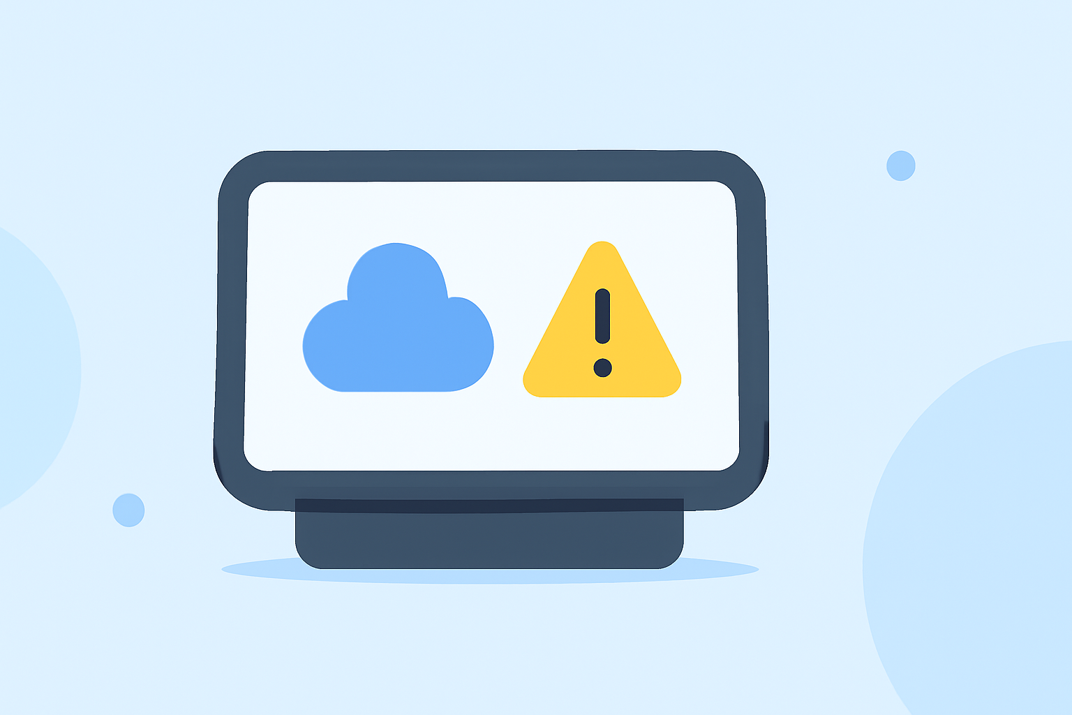
2. Using Low-Resolution Images
Blurry or pixelated visuals can make your display appear unprofessional. Always use high-quality images to ensure clarity and enhance user experience. (bullseyepromotions.com)
3. Poor Font Choices
Illegible fonts can hinder readability. Opt for bold, sans-serif fonts that are easy to read from a distance. Ensure the font size is appropriate for the display's dimensions. (bullseyepromotions.com)
4. Neglecting Color Contrast
Insufficient contrast between text and background can make content hard to read. Use high-contrast color combinations, such as black text on a yellow background, to enhance visibility. (bullseyepromotions.com)
5. Ignoring Readability and Visibility
If your banner can't be read at a glance, it might as well not exist. Test your banner from various distances to ensure readability. (coloursigns.com.au)
6. Overuse and Frequency
Bombarding users with a constant stream of notifications can lead to desensitization. Implement intelligent frequency capping to limit the number of notifications a user receives within a specific timeframe. (notificationbox.com)
7. Lack of User Control
Users appreciate a sense of agency over their digital environment. Provide users with explicit control over notification types and frequency through preference settings. (notificationbox.com)
How Can Clime Enhance Your Weather Notification Experience?
Clime offers a comprehensive solution for weather notifications on smart displays. Its intuitive interface allows for easy customization, ensuring that your notifications are both informative and visually appealing. With real-time updates and accurate data, Clime ensures that your users receive timely and relevant weather information.
What Are the Best Practices for Designing Weather Notification Banners?
- Keep It Simple: Focus on essential information to avoid overwhelming users.
- Use High-Quality Visuals: Ensure all images are clear and professional.
- Choose Readable Fonts: Opt for bold, sans-serif fonts with appropriate sizing.
- Ensure High Contrast: Use color combinations that enhance readability.
- Limit Notification Frequency: Avoid bombarding users with constant updates.
- Provide User Control: Allow users to manage notification preferences.
How Does Clime Address These Challenges?
Clime's platform is designed with user experience in mind, addressing common pitfalls in weather notification banners. Its customizable templates ensure that your notifications are both effective and engaging. By leveraging Clime's features, you can deliver timely and relevant weather information to your users without the common mistakes that often occur in digital signage.
By understanding and avoiding these common mistakes, you can create effective and user-friendly weather notification banners on your smart displays. Utilizing platforms like Clime can further enhance the quality and impact of your notifications, ensuring they serve their intended purpose effectively.