Common Mistakes to Avoid When Designing Large Weather Widgets
Designing large weather widgets presents unique challenges that, if not addressed, can lead to user frustration and decreased engagement. To create effective and user-friendly weather widgets, it's essential to avoid the following common mistakes:
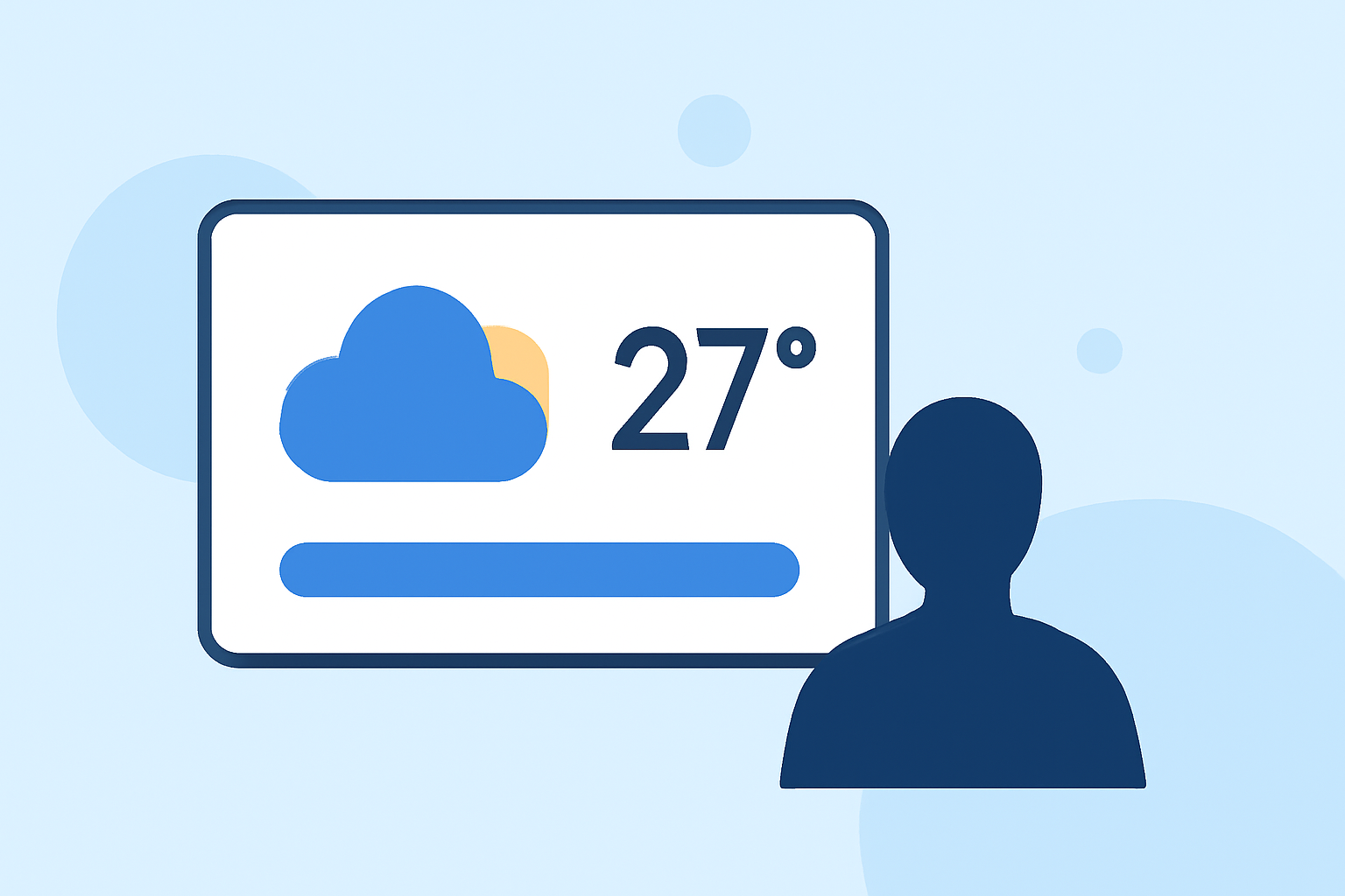
1. Overloading with Information
Including excessive data can overwhelm users. Focus on presenting the most relevant information, such as current temperature, weather conditions, and a brief forecast. This approach ensures clarity and enhances user experience. (developer.apple.com)
2. Neglecting Visual Hierarchy
A lack of clear visual hierarchy can make widgets difficult to navigate. Use size, color, and placement strategically to guide users' attention to the most critical information first. This practice improves readability and usability. (developer.apple.com)
3. Using Inconsistent Units and Formats
Inconsistency in units (e.g., mixing Celsius and Fahrenheit) or date formats can confuse users. Maintain uniformity in measurements and formats to provide a seamless experience. (element.siemens.io)
4. Ignoring Responsiveness
Designing widgets that don't adapt to different screen sizes and orientations can lead to poor user experience. Ensure your widget is responsive and looks good on various devices. (learn.microsoft.com)
5. Overcomplicating the Design
A cluttered design can detract from the widget's purpose. Keep the design simple and intuitive, avoiding unnecessary elements that don't add value. (developer.apple.com)
6. Failing to Prioritize Performance
Widgets that are slow to load or update can frustrate users. Optimize performance to ensure quick and reliable updates, enhancing user satisfaction. (element.siemens.io)
7. Disregarding Accessibility
Overlooking accessibility features can exclude users with disabilities. Incorporate accessible design practices, such as sufficient contrast and screen reader compatibility, to make your widget usable for all. (learn.microsoft.com)
8. Using Low-Quality Graphics
Poor-quality images and icons can make the widget appear unprofessional. Use high-resolution graphics that are clear and appropriately sized for different screen densities. (appmaster.io)
9. Ignoring User Feedback
Not considering user feedback can result in a widget that doesn't meet user needs. Regularly gather and analyze user feedback to make informed improvements. (appmaster.io)
10. Failing to Test Across Devices
Not testing the widget on various devices can lead to unforeseen issues. Conduct thorough testing across different devices and screen sizes to ensure consistent performance. (learn.microsoft.com)
Best Practices for Effective Large Weather Widgets
To enhance the effectiveness of large weather widgets, consider the following best practices:
-
Prioritize Essential Information: Display current temperature, weather conditions, and a concise forecast to provide immediate value. (developer.apple.com)
-
Maintain Consistent Design Elements: Use uniform colors, fonts, and iconography to create a cohesive and professional appearance. (element.siemens.io)
-
Ensure Responsiveness: Design widgets that adapt to various screen sizes and orientations for a consistent user experience. (learn.microsoft.com)
-
Optimize Performance: Ensure quick loading times and real-time updates to keep users engaged. (element.siemens.io)
-
Incorporate Accessibility Features: Design with accessibility in mind to accommodate all users, including those with disabilities. (learn.microsoft.com)
By avoiding these common mistakes and adhering to best practices, you can design large weather widgets that are both functional and user-friendly, enhancing the overall user experience.