A Comprehensive Guide to Customizing Weather Widget Color Themes
Weather widgets are essential tools that provide real-time updates on weather conditions, forecasts, and alerts directly on your device's home screen. Customizing the color themes of these widgets not only enhances their visual appeal but also allows them to seamlessly integrate with your device's overall aesthetic.
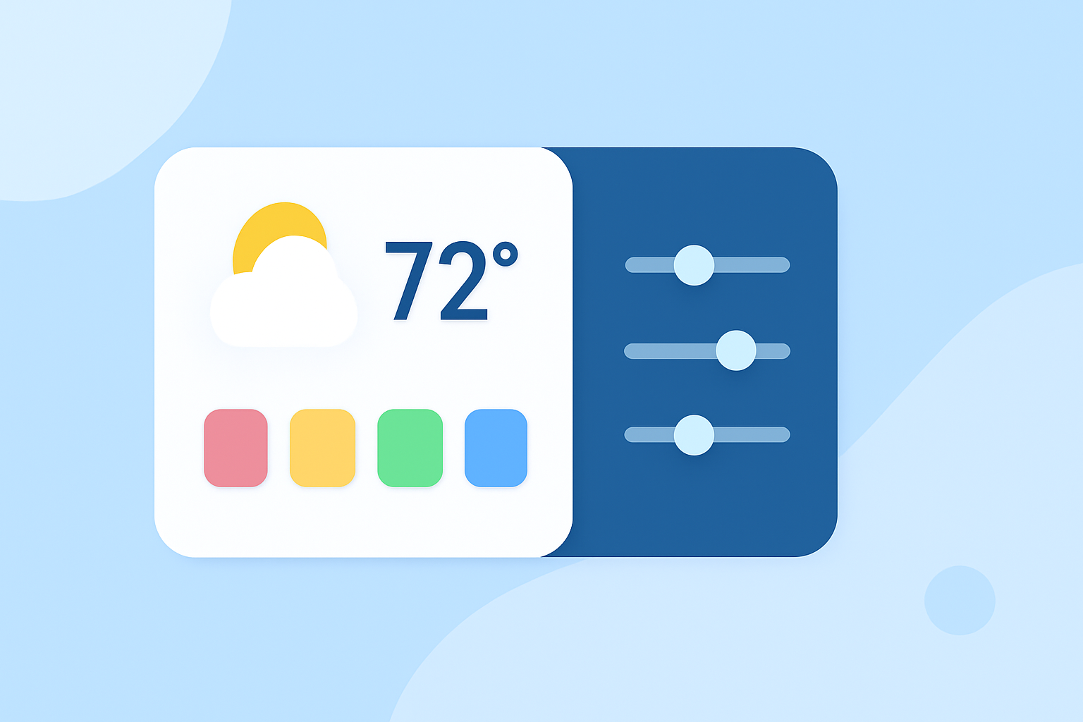
Why Customize Weather Widget Color Themes?
Personalizing your weather widget's color theme offers several benefits:
- Aesthetic Enhancement: Aligns the widget's appearance with your device's theme, creating a cohesive and visually pleasing interface.
- Improved Readability: Adjusting colors can enhance text contrast, making information easier to read at a glance.
- Functional Clarity: Color coding can help distinguish between different weather conditions, providing immediate visual cues.
How to Customize Weather Widget Color Themes
The process of customizing weather widget color themes varies depending on your device and the specific widget application. Below are general steps applicable to most platforms:
- Access Widget Settings:
- On your device's home screen, locate the weather widget you wish to customize.
- Tap and hold the widget until a menu appears.
- Select the option to edit or customize the widget.
- Choose Color Theme Options:
- Within the customization menu, look for color settings or theme options.
- Select from predefined color themes or use a color picker to choose custom colors.
- Adjust Transparency and Contrast:
- Modify the transparency levels to achieve the desired background effect.
- Ensure sufficient contrast between text and background for optimal readability.
- Save and Apply Changes:
- After making adjustments, save the changes to apply the new color theme to your widget.
Popular Color Themes for Weather Widgets
Selecting the right color theme can significantly impact the visual appeal and functionality of your weather widget. Here are some popular themes to consider:
- Ocean Breeze: Utilizes soft blues, seafoam greens, and gentle gradients to evoke a coastal, calming atmosphere. (bemywidget.com)
- Gradient Themes: Incorporates smooth transitions between colors, such as sunset gradients or ocean gradients, adding depth and energy to your home screen. (bemywidget.com)
- Minimal Neutrals: Features warm whites, soft grays, and muted accent colors for a clean and elegant look. (lemon8-app.com)
- Dark Mode Contrast: Employs dark backgrounds with bright accent colors to create a sleek and modern appearance, ideal for night-time use. (lemon8-app.com)
Best Practices for Customizing Weather Widget Color Themes
To ensure your customized weather widget is both functional and visually appealing, consider the following best practices:
- Maintain Readability: Ensure that text and icons are easily readable against the chosen background colors.
- Consistency: Keep the color scheme consistent with your device's overall theme for a cohesive look.
- Contrast: Use contrasting colors to highlight important information, such as severe weather alerts.
- Simplicity: Avoid overly complex color combinations that may clutter the widget's appearance.
Conclusion
Customizing the color themes of your weather widget allows you to create a personalized and functional home screen experience. By selecting appropriate color schemes and following best practices, you can enhance both the aesthetic appeal and usability of your device.
Highlights:
- Ocean Breeze Widget Themes for iPhone | Be My Widget
- Gradient Widget Themes for iPhone — Dynamic Colors | Be My Widget
- Color Widget Picks | 2026 real user experience on Lemon8