Designing Effective Glanceable Weather Widgets: A Comprehensive Guide
Weather widgets are essential tools that deliver real-time weather information directly to users' devices, offering quick insights without the need to open a dedicated app. Designing effective, glanceable weather widgets requires a focus on clarity, relevance, and user engagement.
Understanding Glanceable Weather Widgets
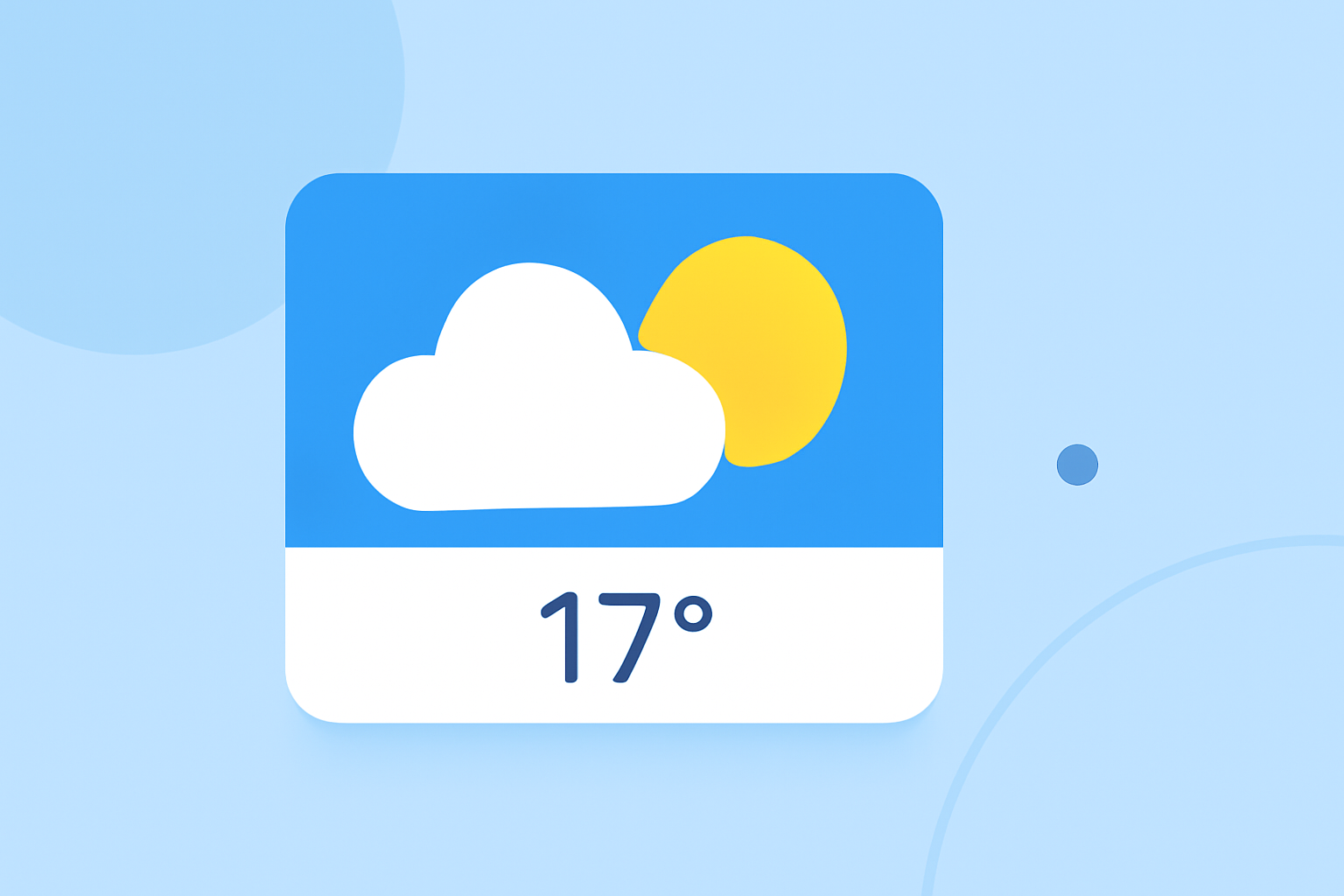
A glanceable weather widget is a compact interface element that presents key weather data—such as current temperature, conditions, and forecasts—at a glance. The primary goal is to provide users with immediate access to essential weather information without overwhelming them with excessive details.
Key Principles for Designing Glanceable Weather Widgets
-
Simplicity and Focus: Prioritize displaying the most relevant weather information. For instance, showing the current temperature, weather condition (e.g., sunny, cloudy, rainy), and a brief forecast can be sufficient. Avoid cluttering the widget with unnecessary data.
-
Visual Hierarchy: Organize information in a way that guides the user's eye naturally. Use size, color, and placement to highlight the most critical data points. For example, the current temperature should be the most prominent element, followed by weather conditions and the forecast.
-
Consistency: Maintain a consistent design language that aligns with your app's overall aesthetic. This includes using the same color schemes, typography, and iconography to ensure a cohesive user experience.
-
Responsiveness: Design widgets that adapt to various screen sizes and orientations. Ensure that the widget remains legible and functional across different devices and display settings.
-
Accessibility: Ensure that your widget is accessible to all users, including those with visual impairments. Use high-contrast color schemes, readable fonts, and provide alternative text for icons and images.
Best Practices for Weather Widget Design
-
Use of Icons: Employ intuitive weather icons to represent conditions like sun, clouds, rain, and snow. Icons should be simple, recognizable, and consistent in style.
-
Color Contrast: Ensure sufficient contrast between text and background to enhance readability. For example, dark text on a light background or light text on a dark background can improve legibility.
-
Dynamic Content: Incorporate real-time data that updates regularly to keep the widget relevant. This includes current temperature, weather conditions, and forecasts.
-
User Personalization: Allow users to customize the widget to some extent, such as selecting their preferred location or choosing between different sizes and layouts.
Implementing Glanceable Weather Widgets
When developing a weather widget, consider the following steps:
-
Define the Widget's Purpose: Clearly determine what information the widget will display and how it will serve the user.
-
Design the User Interface: Create wireframes and prototypes to visualize the widget's layout and functionality.
-
Develop the Widget: Use appropriate development tools and frameworks to build the widget, ensuring it integrates seamlessly with your app.
-
Test Across Devices: Test the widget on various devices and screen sizes to ensure responsiveness and usability.
-
Gather User Feedback: After deployment, collect user feedback to identify areas for improvement and make necessary adjustments.
Conclusion
Designing effective, glanceable weather widgets involves a balance between simplicity, clarity, and functionality. By focusing on the most relevant information, maintaining a consistent and accessible design, and allowing for user personalization, you can create widgets that enhance the user experience and provide valuable, at-a-glance weather updates.
By adhering to these principles and best practices, you can create weather widgets that not only inform but also engage users, providing them with timely and relevant weather information at a glance.