
Designing Large Weather Widgets: A Comprehensive Guide
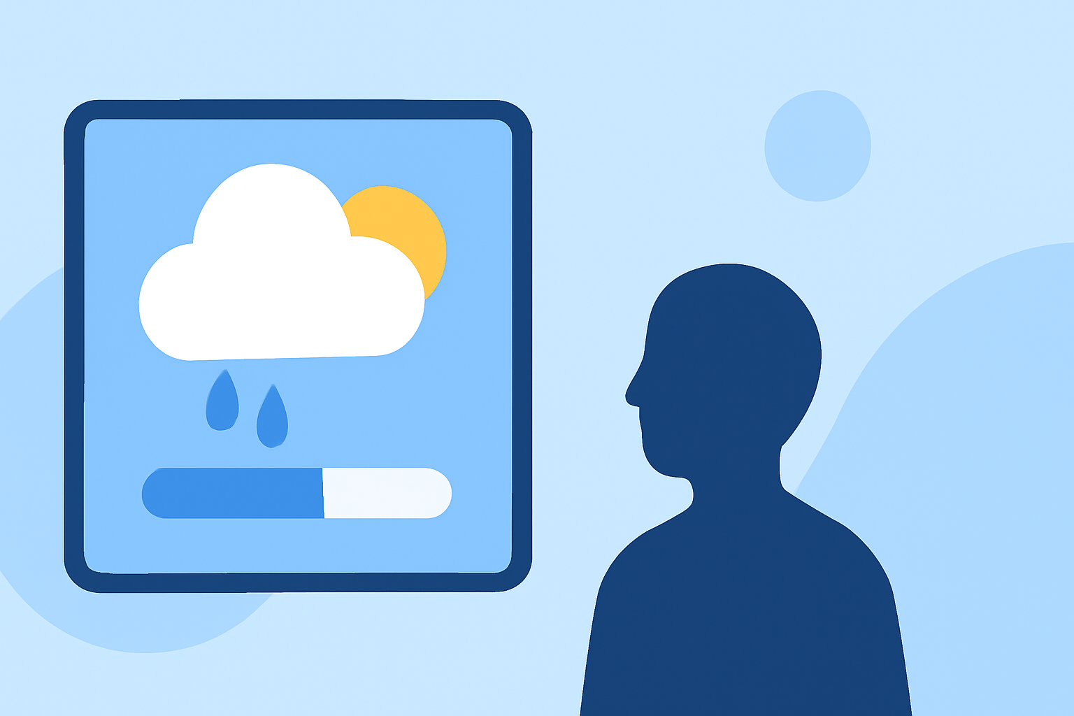
Large weather widgets provide users with detailed and easily accessible weather information directly from their device's home screen. Designing an effective large weather widget involves understanding user needs, adhering to design principles, and ensuring accessibility.
Understanding Large Weather Widgets
Large weather widgets are expanded versions of standard weather widgets, offering more space to display comprehensive weather data. They typically include current conditions, forecasts, and additional details like humidity, wind speed, and precipitation chances. The primary goal is to deliver essential weather information at a glance, enhancing user convenience.
Key Design Principles
-
Simplicity and Clarity: Focus on presenting essential weather information without overwhelming the user. Use clear icons and concise text to convey data effectively.
-
Consistency: Maintain a consistent visual language with your app's overall design. This includes using the same color schemes, fonts, and iconography to ensure a cohesive user experience.
-
Responsiveness: Ensure the widget adapts well to different screen sizes and orientations. This responsiveness is crucial for devices with varying display dimensions.
-
Accessibility: Design with accessibility in mind by providing sufficient contrast ratios and ensuring that text is legible for users with visual impairments.
Content Selection
When designing a large weather widget, prioritize the following content:
-
Current Conditions: Display the current temperature, weather condition (e.g., sunny, cloudy, rainy), and an appropriate icon.
-
Forecast Information: Include short-term forecasts, such as the next few hours or the upcoming day, highlighting expected temperatures and conditions.
-
Additional Details: Provide supplementary information like humidity levels, wind speed, and precipitation chances to offer a comprehensive overview.
Best Practices
-
Use of Icons: Employ intuitive and universally recognized weather icons to represent conditions. This enhances quick comprehension and reduces cognitive load.
-
Typography: Choose legible fonts and appropriate sizes to ensure readability. Maintain a hierarchy in text sizes to guide the user's attention to the most critical information.
-
Color Contrast: Ensure high contrast between text and background to improve readability, especially in varying lighting conditions.
-
Interactivity: Incorporate interactive elements, such as tapping the widget to open the full weather app or accessing detailed forecasts, to enhance user engagement.
Implementing the Widget
To create a large weather widget, follow these steps:
-
Define Widget Size and Layout: Determine the dimensions and layout that best fit your design and provide ample space for the selected content.
-
Design Visual Elements: Create icons, backgrounds, and other visual components that align with your app's branding and the widget's purpose.
-
Develop Functionality: Implement the necessary code to fetch and display real-time weather data, ensuring accuracy and timeliness.
-
Test Across Devices: Test the widget on various devices and screen sizes to ensure responsiveness and functionality.
Conclusion
Designing a large weather widget requires a balance between aesthetics, functionality, and user experience. By adhering to design principles, selecting relevant content, and following best practices, you can create a widget that provides users with valuable weather information at a glance.
For more detailed guidance on widget design, refer to the Widget design fundamentals provided by Microsoft.
Additionally, Apple's Human Interface Guidelines offer insights into creating widgets that are both functional and user-friendly.
By integrating these resources and principles, you can develop a large weather widget that enhances user engagement and provides timely, relevant weather information.