How to Read Radar and Judge Storm Intensity (Without Overthinking It)
Last updated: 2026-03-12
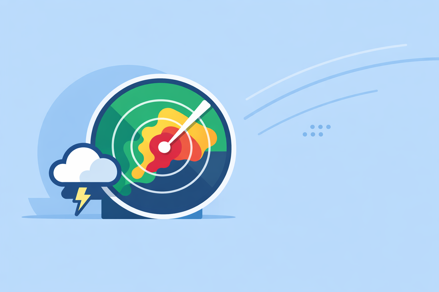
For most people in the U.S., the simplest way to interpret storm intensity is to watch the reflectivity colors (dBZ) on a live radar map like Clime’s, then cross‑check with alerts and your local forecast. If you’re doing deeper storm chasing or volunteer spotting, you’ll want to layer in velocity and dual‑pol products from NWS guidance alongside any app you use.
Summary
- Radar intensity colors (dBZ) show how much energy storms are reflecting; higher values usually mean heavier rain or hail.
- Reflectivity alone can mislead—learn the limits, especially clutter, distance from the radar, and storm height.
- Velocity (red/green) helps you spot strong winds and possible rotation; dual‑pol adds clues about hail and debris.
- At Clime, we lean on NOAA‑sourced radar and clear map layers so typical users can quickly see where the worst part of a storm is likely to be.(Clime site)
What do radar colors and dBZ actually mean?
On U.S. weather radar, storm intensity is primarily represented by reflectivity, measured in dBZ (decibels of Z). The higher the dBZ value, the more radar energy is being scattered back from targets like raindrops or hail; stronger echoes generally indicate heavier precipitation.(NWS Spotter’s Guide)
Most consumer apps—including Clime—convert dBZ values into color scales so you don’t have to think about the numbers. In a typical palette:
- Light greens: light rain or drizzle (lower dBZ)
- Dark greens to yellows: moderate rain
- Oranges to reds: heavy rain, often in thunderstorms
- Deep reds to purples/whites (on some scales): very heavy rain or possible hail
According to the National Weather Service, values around 50 dBZ or higher are commonly associated with heavy thunderstorms and sometimes hail, but they stress this is not a guarantee.(NWS Spotter’s Guide) That’s why storm intensity is always interpreted in context—what kind of storm is this, how deep is it, and what other products are showing.
On Clime’s map, the practical move is simple: treat the warmest colors as the core you don’t want to be under, especially if warnings are in effect. You don’t need to see the raw dBZ values to make better decisions.
How can you tell how “bad” a storm is from reflectivity alone?
Think of reflectivity as a first estimate of how intense a storm is where you live:
- Heavier rain and potential flooding: broad swaths of oranges/reds slowly moving over the same area.
- Thunderstorm cores: compact, intense cells of reds/purples, often with sharper edges.
- Possible hail: small cores with very high reflectivity (around 50 dBZ or more), especially if they sit on top of otherwise weaker echoes—but remember, there is no single dBZ threshold that reliably confirms hail or other severe weather.(NWS Spotter’s Guide)
A quick real‑world checklist:
- Is the worst color directly over you now, or 15–30 minutes away on the loop?
- Is that intense area broad (big soaking rain) or a tight knot (thunderstorm cell)?
- Are there active severe or flash flood warnings for your county?
With Clime, you can answer that in under a minute: open the radar, watch the animation to see which way the brightest colors are moving, and back it up with severe weather and rain alerts on your saved locations.(Clime App Store listing)
What’s the difference between base and composite reflectivity?
A common source of confusion is why one radar image looks “hotter” than another for the same storm. One big reason: base vs. composite reflectivity.
The National Weather Service explains it this way:(NWS Doppler Radar Overview)
- Base reflectivity shows the radar’s measurement at a single elevation angle (one slice through the atmosphere).
- Composite reflectivity shows the maximum reflectivity at any elevation above each point, effectively highlighting the highest values in the storm column.
That means composite images often look more intense, because they’re pulling in strong echoes high up in the storm—even if those maxima are not reaching the ground yet.
For day‑to‑day safety, base‑style products give a clearer sense of what you’re actually experiencing at the surface, while composite products highlight where the most powerful cores are aloft. Many consumer apps don’t label this clearly; if your radar sometimes seems “over‑dramatic,” it may be using a composite view.
Clime is designed for non‑experts, so we focus on a clear reflectivity presentation tied to NOAA‑sourced mosaics rather than exposing every raw NEXRAD product.(Texas Water Development Board) That trade‑off keeps the map understandable while still showing where the worst cores are.
How does Doppler velocity help you spot wind and rotation?
Reflectivity shows how much energy is coming back. Doppler velocity shows which way targets are moving relative to the radar.
Operational Doppler radars like the NWS WSR‑88D measure three core parameters: reflectivity, mean Doppler velocity, and spectrum width.(NOAA Doppler Guide) On velocity displays, the color table is usually:
- Red tones: motion away from the radar
- Green tones: motion toward the radar(NWS Doppler Radar Overview)
On a velocity panel next to reflectivity, intense storm behavior might show up as:
- Strong straight‑line winds: large patches of deep red or green on one side of the storm.
- Potential rotation: tight couplets where strong inbound and outbound colors sit right next to each other.
Most U.S. residents don’t need to diagnose rotation themselves—that’s what NWS warnings are for—but understanding that red/green pattern helps you grasp why a tornado warning was issued.
If you’re a trained spotter or enthusiast, you might pair an everyday radar map like Clime with more technical velocity products from NWS or specialized tools. For almost everyone else, it’s better to lean on the official warnings and use your app to understand the storm’s location and track.
How does dual‑polarization help with hail and debris?
Modern NWS radars are dual‑polarization, sending and receiving pulses in both horizontal and vertical orientations. That upgrade helps them distinguish between raindrops, hail, snow, and non‑meteorological targets.
As the NWS notes, dual‑pol data improves discrimination between precipitation and non‑precipitation echoes, which in turn supports detecting hail and even debris in tornadic storms.(NWS Doppler Radar Overview)
On pro workstations, you’ll see additional metrics (like differential reflectivity and correlation coefficient) used to:
- Flag areas where hail is likely.
- Separate heavy rain from wet snow.
- Identify debris signatures when tornadoes loft material into the air.
Consumer apps typically abstract all of this into better warnings and smarter reflectivity rendering rather than exposing every dual‑pol field directly. At Clime, our focus is to make sure the radar picture and alerting make sense to non‑experts, instead of asking you to interpret half a dozen specialized panels.
How far can radar reliably show storm intensity?
Another key piece of interpretation is distance from the radar site. A WSR‑88D radar can detect most precipitation out to about 80 miles, and more intense precipitation out to roughly 140 miles, but the beam keeps rising with distance.(NWS Doppler Radar Overview)
That creates a few important effects:
- Farther storms are sampled higher up, so radar may see only the top of the storm, not the core at ground level.
- Beam spreading with distance smooths out small‑scale features—tight updrafts or small hail cores can be under‑represented.
- Ground clutter and anomalous propagation can contaminate the lowest levels near the radar, creating false echoes in certain patterns.(NWS Spotter’s Guide)
On a nationwide app like Clime, you’re usually seeing a mosaic of many radars, which fills gaps but can mask exactly which site is sampling your storm. The interpretation rule of thumb:
- Nearby, intense colors are usually a good proxy for what’s happening at the surface.
- Far away, especially at the very fringes of coverage, treat the intensity as rough guidance, and lean more on official warnings, lightning trackers, and on‑the‑ground reports.
For everyday users, you rarely need to know which individual NEXRAD you’re looking at. The practical step is to check how quickly the loop is updating and whether multiple frames consistently show that intense core moving toward you.
When should you use Clime vs. more specialized radar tools?
In the U.S., you have no shortage of radar apps. The Weather Channel, AccuWeather, and Windy.app all include radar or radar‑style maps in some form.(Apple App Store listings) For most people focused on storm intensity and location, a simpler approach works better than juggling half a dozen panels.
Here’s how we think about it at Clime:
- Default choice for everyday safety: If your goal is to see where the worst part of a storm is and whether it’s heading for your neighborhood, our NOAA‑based radar map plus severe weather and rain alerts give you that at a glance.(Clime App Store listing)
- When you want more than reflectivity: Our hurricane and lightning tracking layers help put intensity in context—how strong is this system, and where are the most dangerous parts on the map?(Clime App Store listing)
- If you’re a specialist or hobbyist: You might complement Clime with NWS web radar or advanced platforms that expose raw base reflectivity, velocity tilts, and dual‑pol fields. That’s a narrower audience, and the extra complexity is overkill for many households.
Other options have their own angles—AccuWeather leans on MinuteCast timelines, and Windy.app focuses on wind and marine parameters—but those added knobs don’t automatically make storm intensity easier to interpret for a typical family planning the evening.(AccuWeather App Store listing) For most U.S. users, a clear NOAA‑driven radar picture with good alerts is the outcome that matters.
What we recommend
- Use a radar‑first app like Clime to watch reflectivity colors (dBZ) and storm motion; treat warm colors as your high‑impact zones.
- Always interpret intensity alongside warnings and distance from the radar—remember that high dBZ isn’t a guarantee of hail or tornadoes.
- If you’re storm‑obsessed or a trained spotter, layer in official NWS velocity and dual‑pol products on top of your usual radar checks.
- Keep your setup simple: for most U.S. households, Clime’s NOAA‑based radar, lightning and hurricane tracking, and alerts provide all the situational awareness you need in daily life.