
Mastering Small Weather Widgets: Essential Design Tips
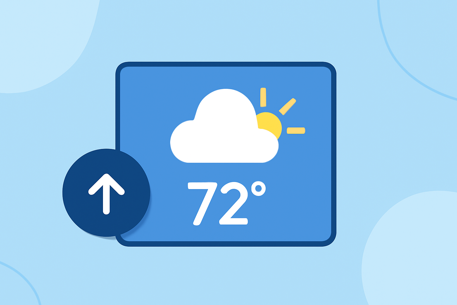
Designing small weather widgets that are both functional and user-friendly requires attention to detail and adherence to best practices. Here are key considerations to ensure your weather widget meets user expectations:
1. Prioritize Essential Information
Focus on delivering the most pertinent weather details, such as current temperature, weather conditions, and a brief forecast. This approach aligns with guidelines that recommend widgets display meaningful content and offer useful actions. (developer.apple.com)
2. Maintain Simplicity and Clarity
A clean and straightforward interface enables users to access the required information easily. Choose a color scheme and layout that reflects the weather conditions, making navigation simple and avoiding information overload. (appmaster.io)
3. Optimize for Multiple Sizes
Design your widget to be adaptable across various sizes, ensuring it remains functional and visually appealing whether displayed in small, medium, or large formats. This flexibility enhances user experience and accessibility. (learn.microsoft.com)
4. Ensure Readability and Accessibility
Use legible fonts and maintain high contrast between text and background to enhance readability. Adhering to accessibility standards, such as the Web Content Accessibility Guidelines (WCAG), ensures your widget is usable by a broader audience. (learn.microsoft.com)
5. Incorporate Dynamic and Relevant Content
Keep the widget's content fresh by displaying timely weather updates and relevant information. This practice encourages users to engage with the widget regularly. (developer.apple.com)
6. Utilize Intuitive Icons and Graphics
Employ easily recognizable weather icons and graphics to represent various conditions, such as sunny, cloudy, rainy, or snowy. High-quality visuals enhance the widget's appeal and user comprehension. (appmaster.io)
7. Limit Information Density
Avoid overcrowding the widget with excessive data. A sparse layout can make the widget seem unnecessary, while an overly dense layout can be less glanceable. Aim for a balance that provides essential information at a glance and allows users to view additional details by taking a longer look. (developer.apple.com)
8. Ensure Consistent Branding
Incorporate brand elements thoughtfully, such as colors and typefaces, to make your widget recognizable without overpowering the useful information. This approach maintains brand identity while prioritizing functionality. (developer.apple.com)
9. Provide Clear Navigation and Actions
Include intuitive navigation options, such as deep links to detailed forecasts or settings, allowing users to access more information seamlessly. This enhances the widget's utility and user engagement. (designsystem.emarsys.net)
10. Test Across Devices and Environments
Ensure the widget performs well across different devices and operating systems, maintaining functionality and visual appeal. Regular testing helps identify and resolve potential issues, providing a consistent user experience.
By adhering to these best practices, you can create small weather widgets that are not only functional but also enhance the overall user experience.