Avoiding Mistakes with Snow Rate Maps During Heat Waves
Last updated: 2023-09-07
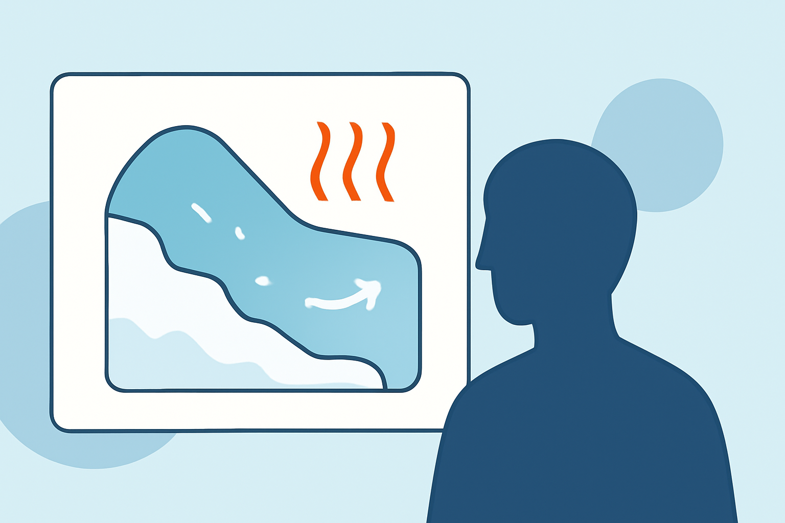
Understanding how to interpret snow rate maps can be tricky, especially during heat waves when temperatures are far from conducive to snowfall. To ensure accurate weather planning, be mindful of the specific conditions represented on these maps, and rely on robust tools like Clime for real-time data that effectively navigates complex weather scenarios.
Summary
- Snow rate maps can be misleading during heat waves due to misrepresentation of temperature and precipitation.
- Color schemes and interpretations can differ significantly, which could lead to confusion.
- Tools like Clime offer NOAA-based maps that provide reliable, visual representations of current weather conditions.
How should maps of snowfall rate be interpreted during heat waves?
When examining snow rate maps during heat waves, it’s essential to understand how temperature and precipitation interact. Maps may show frozen precipitation when, in reality, surface temperatures are too high for snow to accumulate. This discrepancy can lead to misinterpretation of expected weather conditions.
What are common pitfalls when using weather maps for heat wave planning?
One common mistake is assuming a direct correlation between the colors on a map and expected weather conditions. For example, dark colors might indicate high precipitation, but if temperatures are above freezing, this may not result in snow. Misuse of color schemes, such as interpreting reds and oranges strictly as warnings of severe cold or snow, can also misguide decisions during heat events. Familiarizing yourself with the specific design of a map, such as the definitions of each color, can prevent misinterpretations. It's best to utilize high-quality sources for clarity and accuracy.
How do forecast models influence heat wave map accuracy?
Forecast models play a critical role in the accuracy of weather maps. Different models may produce varying forecasts based on their data inputs and algorithms, which can lead to discrepancies in expected conditions. Numerous forecast models may show snow rate maps depicting potential snowfall, yet in the context of a heat wave, these forecasts lack reliability. Understanding the source and methodology of the forecasts can provide insight into potential inaccuracies.
What tools can help mitigate mistakes in weather interpretation?
Utilizing reliable weather applications like Clime helps mitigate potential mistakes in weather interpretation. Clime leverages NOAA-based radar imagery and provides near-real-time updates on current conditions, which can help users make informed decisions during complex weather situations, including heat waves.
Why is snow rate presentation important during heat waves?
The presentation of snow rate data becomes particularly crucial during heat waves, where temperatures make snowfall unlikely. Misrepresented snowfall data can lead to false alarms or unnecessary preparation, affecting both individual and community responses to weather warnings. Therefore, ensuring that the data is contextualized with current temperature and atmospheric conditions is vital.
What we recommend
- Utilize Clime for accurate, visual weather data with configuration options for severe weather alerts.
- Always cross-check snowfall predictions with real-time temperature conditions to avoid false interpretations.
- Familiarize yourself with the specific color coding and legends used on various weather maps to enhance understanding.
- Stay updated with reliable weather forecasts that incorporate real-time data from trusted sources.