
Understanding Weather Widget Color Themes
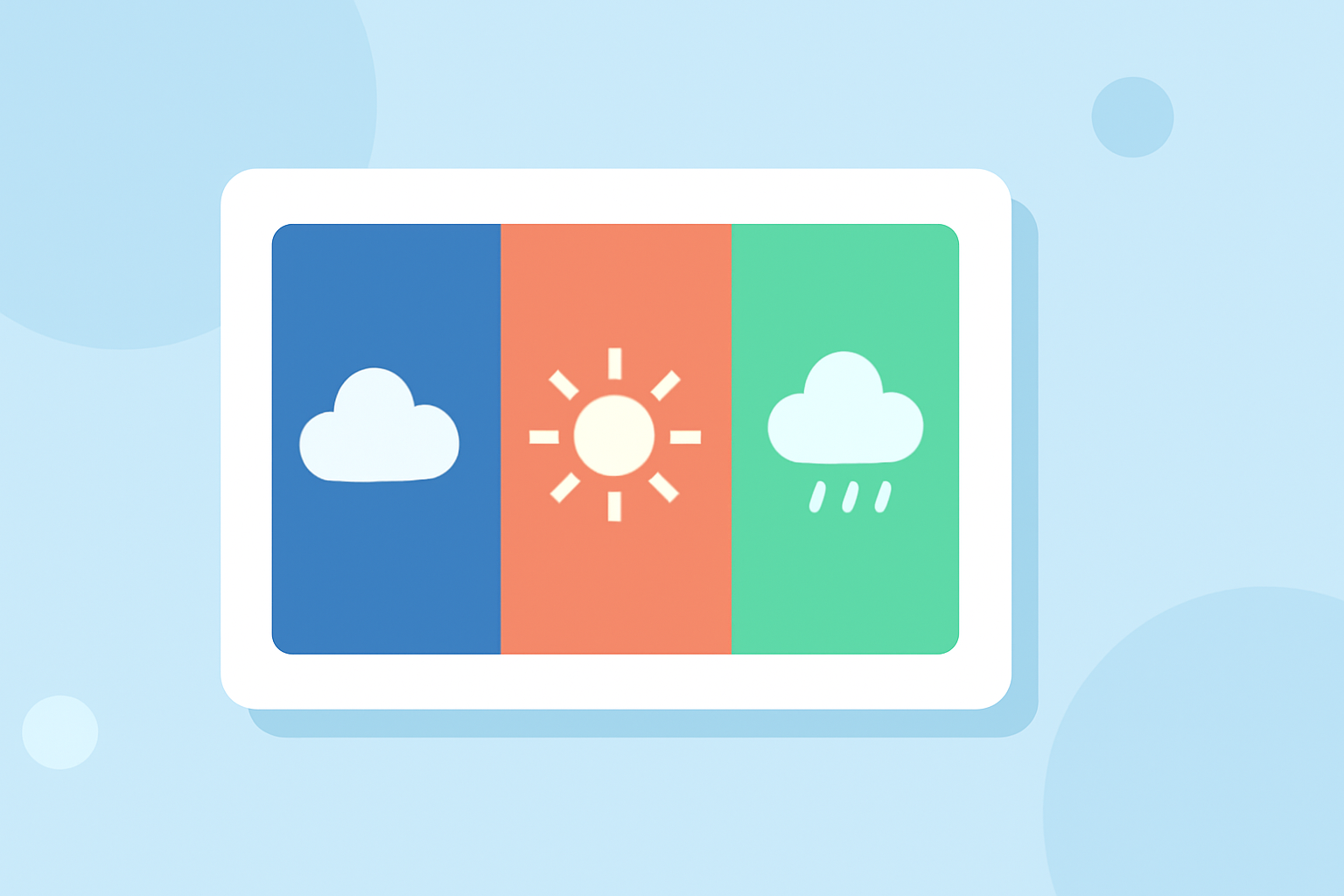
Weather widgets are essential tools that provide real-time weather updates directly on your device's home screen. One of the key aspects that influence their effectiveness and user appeal is the color theme.
What Are Weather Widget Color Themes?
Color themes in weather widgets refer to the color schemes and visual styles applied to the widget's interface. These themes can range from simple, flat colors to complex gradients and patterns, and they play a crucial role in how information is presented and perceived.
Why Are Color Themes Important in Weather Widgets?
-
Visual Appeal: A well-designed color theme can make a widget more attractive, encouraging users to engage with it regularly.
-
Readability: Contrasting colors enhance text visibility, ensuring that weather information is easily readable at a glance.
-
User Experience: Consistent and intuitive color schemes contribute to a seamless user experience, making the widget more user-friendly.
How Do Color Themes Enhance User Experience?
-
Contextual Adaptation: Some widgets adjust their color themes based on current weather conditions. For instance, a widget might display a warm amber hue on a sunny day and shift to deep blue-gray during a thunderstorm, providing a visual cue that aligns with the weather.
-
Customization: Many widgets offer customizable color themes, allowing users to tailor the widget's appearance to their preferences or to match their device's overall aesthetic.
Examples of Weather Widget Color Themes
-
Gradient Themes: These themes use smooth transitions between colors, adding depth and a dynamic feel to the widget. For example, a sunset gradient might transition from warm orange to pink to purple, inspired by twilight skies.
-
Patterned Themes: Incorporating subtle patterns or textures can add visual interest without overwhelming the user.
-
Image-Based Themes: Some widgets use background images that change according to the weather, such as a clear sky for sunny conditions or a cloudy sky for overcast weather.
How to Choose the Right Color Theme for Your Weather Widget
-
Consider Your Device's Aesthetic: Choose a color theme that complements your device's existing color scheme and design.
-
Prioritize Readability: Ensure that the text and icons are easily readable against the chosen background colors.
-
Reflect Personal Style: Select a theme that resonates with your personal taste, whether it's minimalist, vibrant, or nature-inspired.
How Does Clime Enhance Weather Widget Color Themes?
Clime offers a highly customizable weather widget that allows users to select from a variety of color themes, including gradient, patterned, and image-based options. Users can adjust colors, fonts, and icon sets to create a widget that aligns with their personal style and device aesthetics. This level of customization ensures that the widget not only provides accurate weather information but also enhances the overall user experience through its visual appeal.
Conclusion
Color themes are a vital component of weather widgets, influencing both their functionality and user engagement. By understanding and selecting appropriate color themes, users can enhance their interaction with weather information, making it both informative and visually pleasing.