
Understanding Weather Widget Color Themes
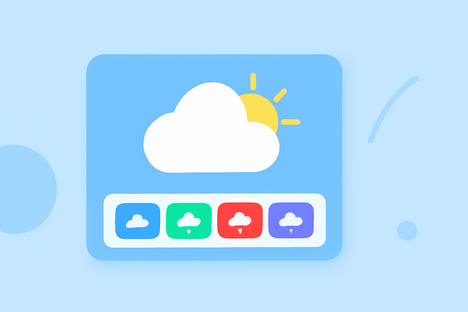
Weather widgets are essential tools that provide real-time weather information directly on your device's home screen. One of the key features that enhance their usability is the use of color themes. These color schemes not only make the widgets visually appealing but also convey important weather information at a glance.
What Are Weather Widget Color Themes?
Color themes in weather widgets refer to the use of specific colors to represent various weather conditions, temperatures, and times of day. By associating certain colors with particular weather states, these widgets enable users to quickly interpret weather data without needing to read detailed text.
Common Color Themes and Their Meanings
Different weather widgets employ various color schemes to represent weather conditions. Here are some common examples:
- Temperature Ranges:
- Dark Blue: Extremely cold temperatures (below 32°F or 0°C)
- Light Blue: Cold temperatures (32°F to 59°F or 0°C to 15°C)
- Green: Mild temperatures (59°F to 68°F or 15°C to 20°C)
- Yellow: Warm temperatures (68°F to 77°F or 20°C to 25°C)
- Orange: Hot temperatures (77°F to 86°F or 25°C to 30°C)
- Red: Extremely hot temperatures (above 86°F or 30°C)
This color coding allows users to quickly assess the temperature range for the day. (makeuseof.com)
- Time of Day:
- Light Backgrounds: Represent daytime hours
- Dark Backgrounds: Indicate nighttime hours
This distinction helps users understand whether the weather conditions are occurring during the day or night. (developer.apple.com)
- Weather Conditions:
- Sunny: Bright yellow or orange
- Cloudy: Shades of gray
- Rainy: Blue or gray with raindrop icons
- Snowy: White or light blue with snowflake icons
These color indicators provide immediate visual cues about the prevailing weather conditions.
How Do Color Themes Enhance User Experience?
The strategic use of color themes in weather widgets offers several benefits:
- Quick Interpretation: Users can instantly grasp weather information without reading detailed descriptions.
- Aesthetic Appeal: Well-designed color schemes make widgets more attractive, encouraging users to engage with them regularly.
- Accessibility: Color coding can aid users with reading difficulties or those who prefer visual information.
Customizing Weather Widget Color Themes
Many weather widgets allow users to customize color themes to match their preferences or device aesthetics. For instance, some widgets offer options to change accent colors, background themes, and even icon colors. This customization ensures that the widget not only provides functional information but also complements the user's device theme. (support.onelouder.com)
Conclusion
Color themes in weather widgets play a crucial role in enhancing user experience by providing intuitive, quick, and visually appealing weather information. By understanding and customizing these color schemes, users can tailor their weather widgets to better suit their needs and preferences.
Highlights:
- How to Read the Colored Bars on Apple’s 10-Day Weather Forecast, Published on Monday, April 04
- What the Colored Bars Mean in the iPhone Weather App, Published on Wednesday, December 08
- Widgets | Apple Developer Documentation