
Visualizing Arctic Climate Trends on Your Tablet
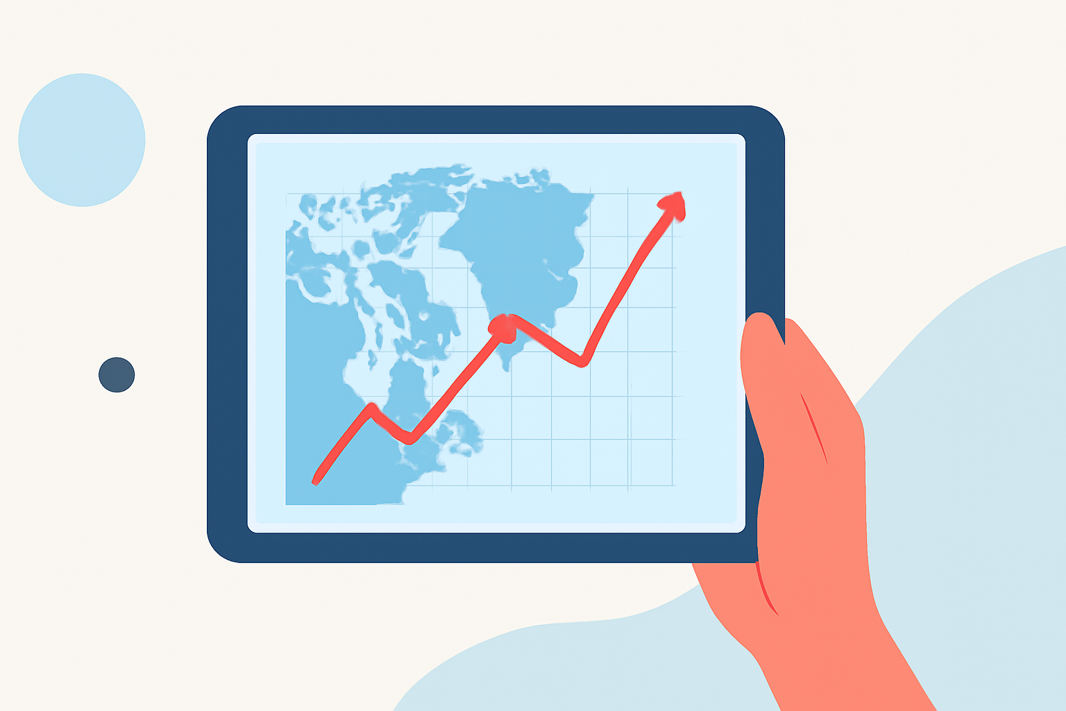
Understanding Arctic climate trends is crucial for grasping the broader implications of global climate change. With the advancement of technology, accessing and visualizing these trends on a tablet has become more feasible. This article explores how you can effectively visualize Arctic climate trends on your tablet using interactive tools and resources.
Why Visualize Arctic Climate Trends?
The Arctic is experiencing rapid changes, including rising temperatures, diminishing sea ice, and altered precipitation patterns. Visualizing these trends helps in:
- Understanding Changes: Grasping the magnitude and pace of Arctic transformations.
- Educating Others: Sharing insights with peers, students, or the public.
- Informed Decision-Making: Supporting policy decisions and personal actions.
Interactive Tools for Tablet Visualization
Several platforms offer interactive maps and charts that can be accessed via tablets:
-
Satellite Observations of Arctic Change (SOAC): This platform transforms satellite data into interactive maps showcasing surface air temperatures, sea ice extent, snow cover, and more. (nsidc.org)
-
Climate Time Machine: An interactive tool by NASA that visualizes changes in Arctic sea ice, global temperature, and other climate indicators over time. (climate.nasa.gov)
-
Climate Impact Visualizer: Offers interactive maps and charts of climate anomalies and extreme weather, including Arctic-specific data. (netzeroaccelerator.io)
Accessing These Tools on Your Tablet
To effectively use these tools on your tablet:
-
Ensure Compatibility: Most of these platforms are web-based and should be accessible through standard tablet browsers.
-
Stable Internet Connection: Interactive maps and animations require a reliable internet connection for smooth operation.
-
Optimal Viewing: For the best experience, use tablets with larger screens and higher resolutions.
Benefits of Using Tablets for Visualization
-
Portability: Access data anywhere, making it convenient for on-the-go learning or presentations.
-
Touch Interface: Interact directly with maps and charts, enhancing engagement and understanding.
-
High-Resolution Displays: Modern tablets offer clear visuals, crucial for detailed climate data.
Limitations to Consider
While tablets offer many advantages, there are some limitations:
-
Processing Power: Complex visualizations may run slower on less powerful tablets.
-
Screen Size: Smaller screens can make detailed maps harder to interpret.
-
Battery Life: Extended use of interactive tools can drain battery life quickly.
Conclusion
Visualizing Arctic climate trends on your tablet is an effective way to engage with and understand the rapid changes occurring in the Arctic. By utilizing interactive tools and considering the optimal use of your device, you can gain valuable insights into these critical environmental shifts.
Highlights:
- Visualizing Climate Change in the Arctic – Center for Data Innovation, Published on Wednesday, October 06
- Charting sea ice decline: The rise of Charctic | National Snow and Ice Data Center, Published on Sunday, September 08
- Climate Time Machine