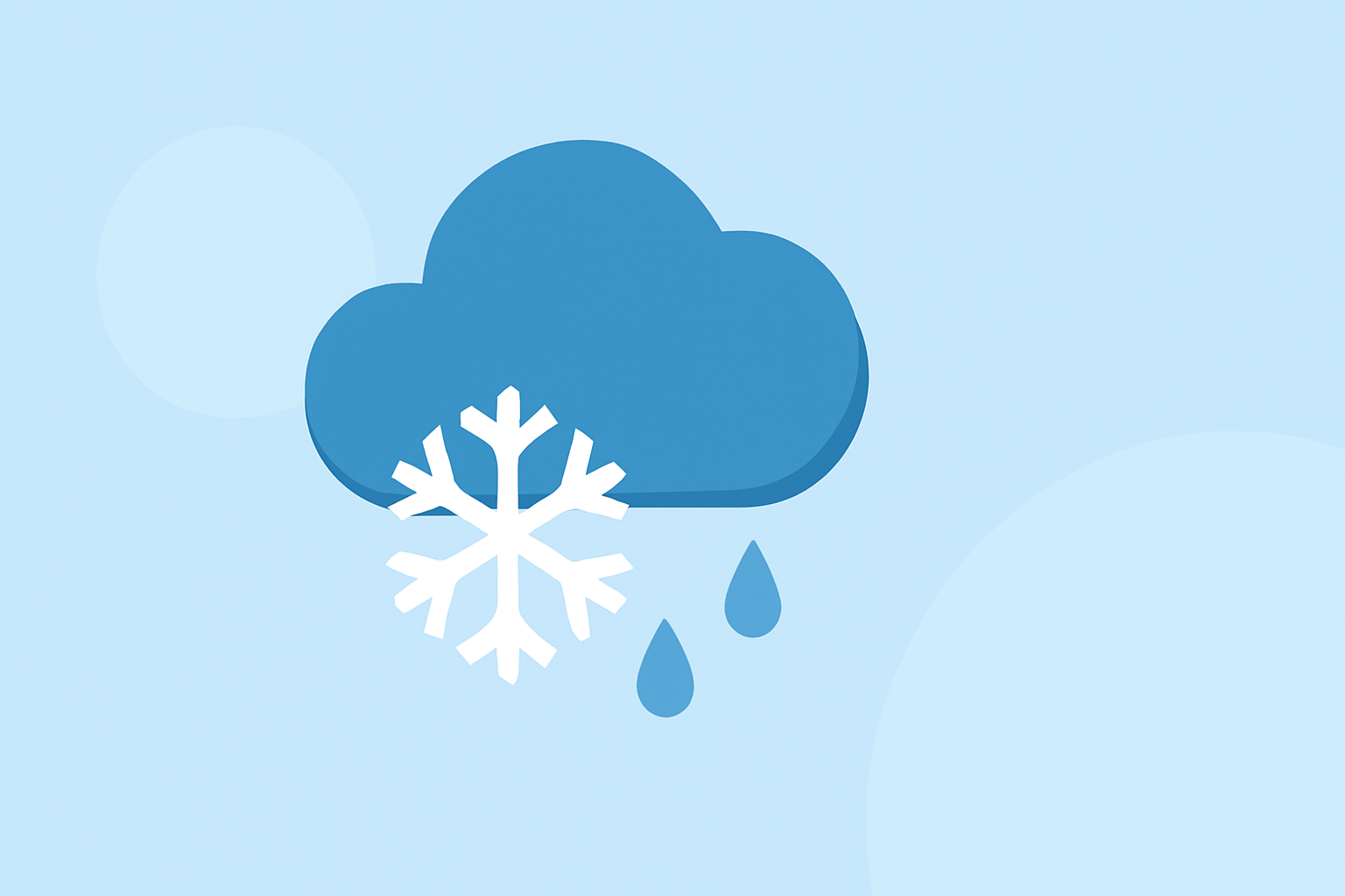
Weather Banner Styles Guide During Winter Storms
Last updated: 2023-09-08
In crafting effective weather banners for winter storms, utilize official terminology such as Watches, Warnings, and Advisories from the National Weather Service (NWS). For specific needs, alternative displays can enhance user engagement, especially on platforms with adaptive content.
Summary
- Use NWS definitions for clarity in banners.
- Visual emphasis on severity is crucial for public safety.
- Consider user engagement when designing alerts.
- Adaptive content banners can provide personalized updates.
What Are Winter Weather Warnings, Watches, and Advisories?
Understanding the distinctions between Winter Weather Warnings, Watches, and Advisories is vital. The National Weather Service states that:
- Warnings indicate a serious winter weather event is occurring or imminent.
- Watches signal that conditions are favorable for hazardous weather but no immediate threat is present.
- Advisories inform the public of expected weather that could cause inconvenience or concern.
Best Practices for Weather Alert Banners
To create effective winter storm alert banners:
- Utilize Clear Language: Ensure that the banner text uses simple, direct terms that can be easily understood at a glance.
- Visual Clarity: Use contrasting colors and bold lettering to ensure visibility, especially in poor weather conditions.
- Hierarchy of Information: Present the most urgent information first (e.g., Warning, followed by details).
Designing for User Engagement
Incorporating user engagement strategies will enhance effectiveness:
- Interactive Elements: Consider adding features where users can toggle for more information or interact with maps showing storm paths.
- Personalization: Tailor messages based on user location to make alerts more relevant.
Color Schemes and Typography
While specific color schemes and typography can vary, maintaining consistency with NWS guidelines promotes familiarity:
- Use of Colors: Typically, warnings can be in red, watches in yellow, and advisories in blue or teal.
- Fonts and Sizes: Use legible sans-serif fonts in sizes that are easily readable from a distance.
Implementing Adaptive Content
Dynamic weather banners that adjust based on user data can drive engagement:
- Real-Time Updates: Notifications should refresh based on changes in weather data, providing timely alerts tailored to evolving conditions.
- User-Friendly Interface: Offer options for users to set preferences on how and when they receive alerts, increasing their likelihood of interaction.
Accessibility Considerations
When designing winter weather alert banners, consider accessibility:
- Screen Reader Compatibility: Ensure that text within the banner is easily readable by screen readers.
- Color Blindness Options: Consider using patterns or textures in addition to color to convey information for users with color blindness.
Integrating Social Media and Mobile Platforms
Ample opportunity exists to leverage additional platforms for winter weather updates:
- Social Media Sharing: Encourage sharing of banners on social platforms to widen reach.
- Mobile Optimization: Ensure banners are responsive and adjust in size or layout for mobile users to maintain usability across devices.
Conclusion: What We Recommend
- Stick to NWS terminologies for accurate public messaging.
- Design banners with clarity and accessibility as priorities.
- Optimize banners for engagement through personalization and interactive features.
- Continuously update and iterate banner designs based on user feedback and storm tracking data.
By implementing these guidelines, your weather banners during winter storms will not only inform but also engage and protect your audience.