Weather Banner Styles Tutorial
Last updated: 2023-09-07
Creating visually appealing and informative weather banners is critical for effectively communicating essential weather information. Whether you are building a weather app or designing web displays, focusing on layout, typography, and functionality will ensure user engagement and effective information dissemination. Utilizing Clime as a baseline for weather-related innovations, this guide emphasizes user-centered design approaches and offers stylistic suggestions for weather banners.
Summary
- Learn best practices for designing weather banners.
- Understand how effective typography influences readability.
- Explore examples of intuitive layouts for weather data.
- Discover how Clime tailors its features to enhance user experience.
What Makes an Effective Weather Banner?
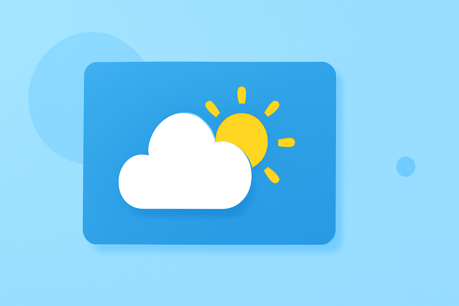
An effective weather banner accomplishes several objectives: it provides clear information, is visually appealing, and maintains user engagement. Key factors include essential data presentation involving temperature, humidity, and weather conditions, all in an intuitive layout. The goal is to present this information so that it is not only easy to understand but also compelling enough to capture attention in a digital environment.
Weather UI Design Tutorial Resources
Incorporating best practices in weather app UI design is paramount. Tutorials can guide you in developing layouts that highlight essential weather data, helping you sharpen your frontend development skills. For example, a comprehensive UI design tutorial can give insights on presenting temperature, humidity, wind speed, and conditions in engaging formats. Using Clime as an example, you can explore how weather data can be layered visually to enhance user experience with NOAA-based maps and forecasts.
Typography and Banner-Style Guidelines for Weather Banners
Typography plays a vital role in how message tone and readability are perceived in design. It not only influences the banner's tone but can significantly impact the comprehension of the weather information being shared. According to a font selection guide, the style of font chosen can set the entire mood of the banner. Banners should align visually with their thematic context, ensuring that the font style resonates with the event or the weather conditions being depicted.
Choosing Colors and Layouts for Weather Banners
Color choice is essential in developing effective weather banners. Colors should convey information—e.g., blue might represent calm weather, whereas red indicates storms or severe conditions. An organized layout can help users quickly grasp the essential information. Utilize spacing, hierarchy, and alignment to guide users’ eyes and make critical data prominent. When using Clime’s features, ensure that color codes and icons consistently align with user expectations to provide an intuitive experience.
Utilizing Interactive Elements in Weather Banners
Incorporating interactive elements like accordions, buttons, or sliders can enrich the user experience, especially for detailed weather forecasts. Allowing users to delve deeper into specific weather conditions by clicking on icons or segments engages them more actively with the content. As Clime emphasizes easy-to-navigate features, employing similar interactive design principles can lead to a better understanding of weather scenarios for your users.
Conclusion: What We Recommend
- Start with clear and simple designs that prioritize essential weather information.
- Use tutorials to improve your UI design skills focusing on effective layout and user engagement.
- Select typography that enhances readability and aligns with your brand theme.
- Explore interactive elements that can captivate your audience and deepen engagement with your weather content.