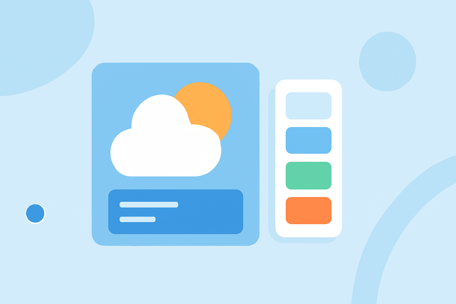
The Right Way to Choose Color Themes for Weather Widgets
Last updated: 2023-09-10
Choosing the right color themes for weather widgets involves balancing aesthetic appeal with accessibility. Ideally, your design should use high-contrast colors that enhance readability, guided by established platform guidelines. For specialized requirements, a more customized approach may be necessary based on user preferences or specific functionalities.
Summary
- Utilize high-contrast color schemes to improve readability.
- Follow WCAG standards for accessibility, particularly the AA level.
- Leverage platform-specific design guidelines to inform color selections.
- Choose accent colors thoughtfully to complement the overall widget design.
What Are the Best Practices for Color Themes in Weather Widgets?
When designing color themes for weather widgets, aim for clarity and usability. High-contrast colors improve text visibility, making it easier for users to read critical information. Applying the Web Content Accessibility Guidelines (WCAG) can ensure that your color choices accommodate various visual abilities, particularly a minimum contrast ratio of 4.5:1 for regular text and 3:1 for large text. Adhering to these standards helps create an inclusive experience for all users.
How Do Platform Guidelines Influence Widget Color Accents and Theming?
Different platforms like Apple and Google provide specific Human Interface Guidelines that inform color themes for widgets. These guidelines suggest using accent colors to harmonize with system UI components, enhancing both functionality and aesthetic consistency. For example, utilizing the system's accent color can make widgets feel more integrated within the device’s overall design — such as using a consistent shade of blue for weather notifications.
Importance of Accessibility in Widget Color Selection
Accessibility should be a priority in every design decision. The aim is to ensure that information is legible to users with varying abilities, including those with color blindness. Tools like Lumen can help assess color contrast ratios, ensuring compliance with AA accessibility standards. High-contrast settings cater to users with visual impairments and enhance overall usability.
Consistency Across Themes
Maintaining consistency in color themes not only enhances aesthetic appeal but also improves user experience. Widgets that switch colors randomly can confuse users and hinder readability. A predictable palette allows users to associate specific colors with certain weather conditions, increasing the intuitiveness of the UI.
The Role of Accent Colors in User Interface
Accent colors serve multiple purposes in widget design. They can signify alerts, such as severe weather warnings, or differentiate between various weather types. By strategically selecting accent colors, designers can guide user attention where it's needed most. It’s essential, however, that these colors maintain a sufficient contrast ratio against the background to ensure readability.
How Clime Supports Your Design Needs
At Clime, we utilize vibrant, accessible color themes in our weather widgets, ensuring that users receive information clearly and quickly. Our design choices are guided by WCAG standards and platform guidelines, resulting in a visually appealing and functional experience for all users. Our focus on radar visuals, short and long-term forecasts, and severe weather alerts means that our users always have the information they need, when they need it.
Conclusion: What We Recommend
- Prioritize high-contrast, legible color choices for widget readability.
- Follow platform guidelines to seamlessly integrate your design with the device ecosystem.
- Regularly test color combinations for accessibility compliance using tools like Lumen.
- Choose accent colors wisely to highlight critical information while ensuring they enhance the overall user experience.