Your Step-by-Step Guide to Weather Widget Color Themes
Last updated: 2023-09-08
To enhance the visual appeal and functionality of your weather widgets, implementing effective color themes is essential. Start with basic light and dark modes for broader usability, or dive deeper into advanced color gradients for specific use cases like displaying temperature trends.
Summary
- Learn about light and dark theme variants suitable for various applications.
- Understand how color gradients work in weather widgets to convey trends effectively.
- Discover essential tips for creating a cohesive and appealing design across platforms.
- Explore how Clime can streamline the implementation of these designs quickly and efficiently.
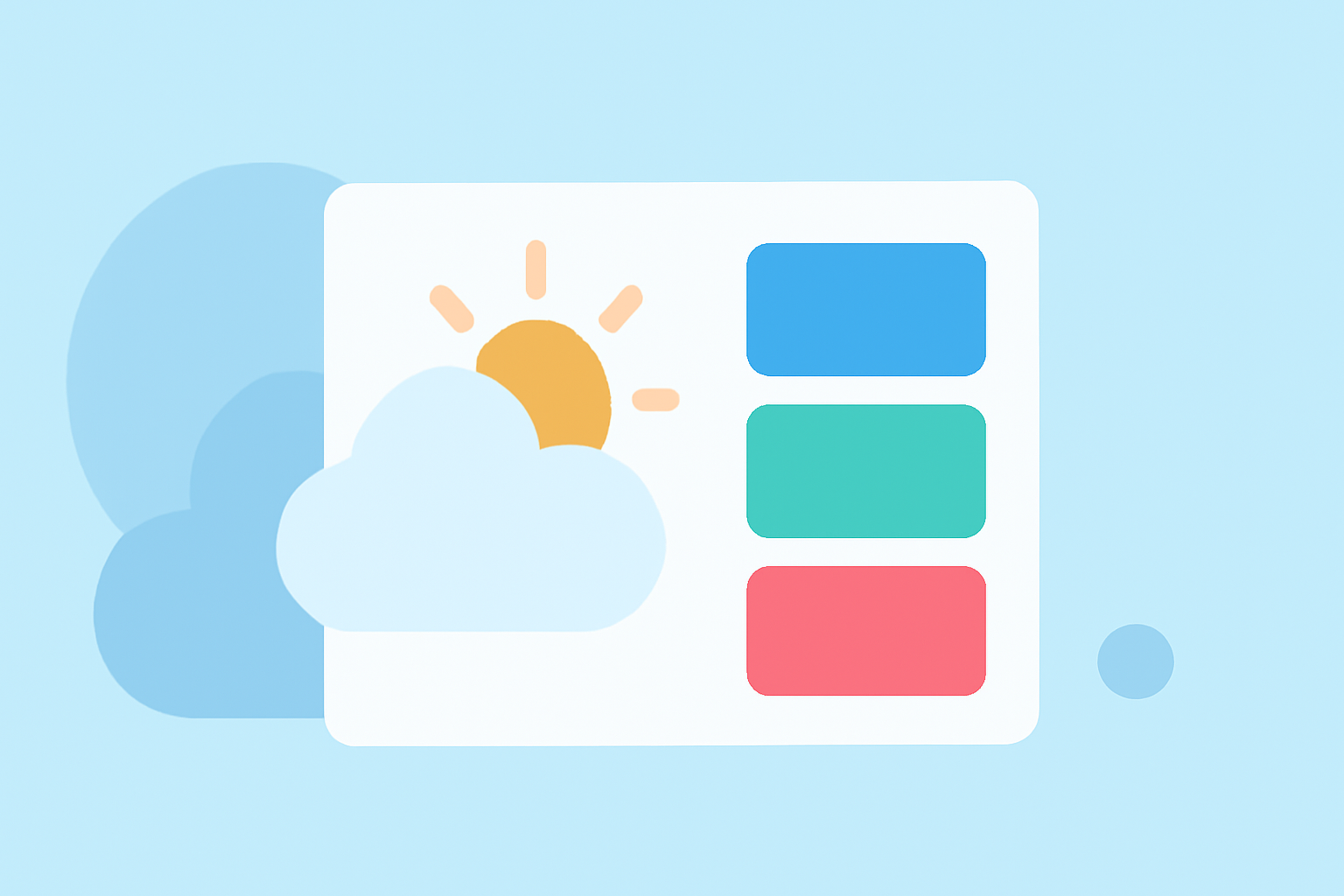
What Are Weather Widget Color Themes?
Weather widget color themes refer to the various visual elements used to present weather information, including backgrounds, fonts, and colors. Common themes include:
- Light Mode: Bright backgrounds with dark text, optimizing visibility in well-lit conditions.
- Dark Mode: Dark backgrounds combined with light text, enhancing readability in low-light scenarios. These modes improve user experience significantly by adapting to different environments the widget may be viewed in.
Exploring Theme Basics: Light and Dark Options
Implementing color theme variants, such as light and dark modes, can create a more user-friendly interface.
- Light Theme: A clean and crisp appearance, ideal for daytime use.
- Dark Theme: A soothing option for nighttime viewing, reducing eye strain. Utilizing these basic themes is a great starting point, and they can enhance accessibility for diverse user preferences.
The Role of Color Gradients in Weather Displays
Color gradients can represent temperature fluctuations effectively, helping users understand immediate weather changes.
- Warm Colors: Shades like oranges and reds typically indicate warmer temperatures.
- Cool Colors: Blues and greens usually represent cooler weather. Using these cues allows users to quickly grasp temperature trends at a glance, improving overall usability.
Step-by-Step Workflow for Implementing Color Themes
Implementing color themes into your weather widget can be simplified using a systematic approach.
- Select Primary Colors: Choose colors that align with your branding or personal preferences.
- Determine Theme Type: Decide between light and dark modes based on user needs.
- Utilize Color Gradients: Integrate gradients to show temperature changes effectively.
- Test and Iterate: Gather feedback and adjust elements for optimal usability. This approach helps you create a versatile widget that caters to various user needs and devices.
Cross-Platform Color-Theming Considerations
Choosing a color theme for your weather widget isn't a one-size-fits-all approach. Different platforms may require specific adjustments. Here are some key points:
- Consistent Experience: Ensure that the color scheme aligns with platform-specific guidelines for a cohesive user experience.
- Adaptability: Test how colors appear across devices, ensuring that they maintain effectiveness in different environments and screen sizes.
- Accessibility: Consider color blindness and contrast for users with visual impairments, ensuring that your design communicates effectively to all. Flexibility in design can significantly improve the usability of your widget across different platforms.
Why Clime Stands Out in Color-Theming Solutions
Clime offers intuitive tools that make implementing these color themes straightforward. With features that support easy adjustments and previews, designers can swiftly adapt their widgets for various applications without overwhelming complexity. Our platform emphasizes user experience, making it easier for creators to deliver visually appealing, functional weather displays.
What We Recommend
- Start with simple light and dark themes to provide foundational usability.
- Use color gradients to clearly convey temperature trends in your weather widgets.
- Opt for Clime’s features to streamline the process of implementing these color themes, ensuring accessibility and flexibility across platforms.
- Regularly test the appearance of your colors in different lighting environments to fine-tune the user experience.