Weather Widget Color Themes: Mistakes to Avoid During Travel Days
Last updated: 2023-09-08
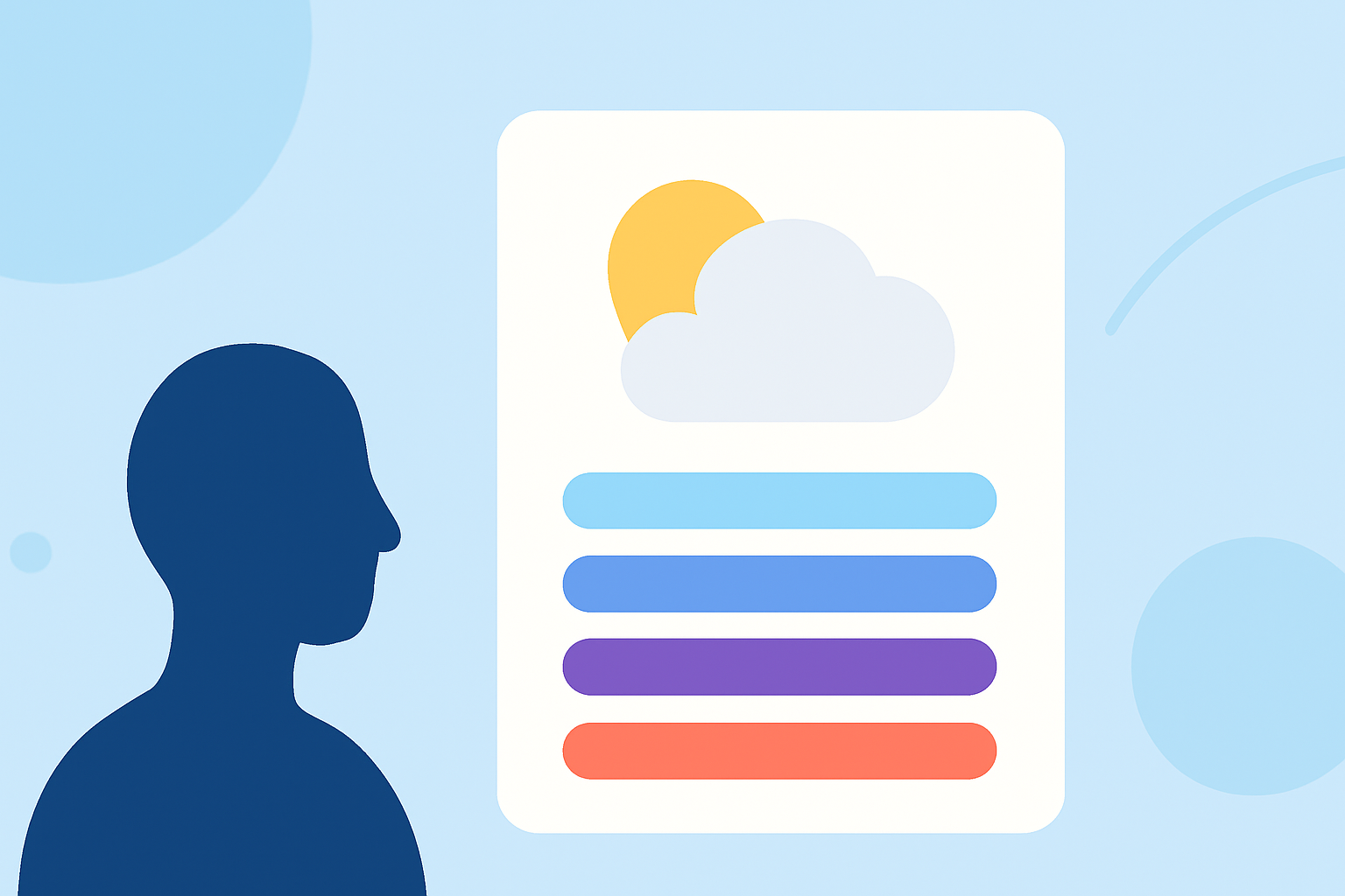
When designing weather widgets for travel, prioritize high-contrast color themes to enhance visibility, especially in bright outdoor scenarios. While you can explore customizations based on personal taste, maintaining accessibility should remain a top priority for the best user experience.
Summary
- High-contrast themes improve widget visibility, especially outdoors.
- Ensure accessibility for various users, including those with visual impairments.
- Avoid overly complex color schemes that can confuse users.
- Choose a reliable weather app to manage your travel plans effectively.
Why is Color Contrast Important for Weather Widgets During Travel?
High-contrast color themes are crucial for weather widgets used during travel days as they ensure readability under varying lighting conditions. Enhanced contrast allows travelers to quickly assess weather information, making it safer for outdoor activities. Properly designed widgets can help prevent misunderstandings about weather alerts or conditions, reducing unexpected challenges on the road.
What Accessibility Features Should Weather Widgets Include?
Accessibility is key when designing weather widgets. Incorporate features such as:
- High-contrast color options that are easily perceivable in different lights.
- Text size adjustments for better readability.
- Voice commands or audio readouts for critical alerts. Such features make widgets usable for individuals with diverse needs, enhancing overall user engagement.
How Can You Ensure Weather Data is Readable in Bright Outdoor Lighting?
To optimize readability of weather data in bright conditions, consider:
- Using a light background with darker text for contrast.
- Making critical information larger and more prominent.
- Implementing an automatic brightness adjustment feature based on ambient light. These adjustments can significantly improve a widget’s usability for outdoor travelers needing quick weather updates.
What Mistakes Should Be Avoided When Choosing Color Themes?
Here are some common mistakes to avoid:
- Overly Saturated Colors: While bright colors may be eye-catching, they can make text difficult to read.
- Inconsistent Color Usage: Mixing various colors for similar types of information may confuse users; consistency aids comprehension.
- Neglecting Contrast Ratios: Failing to adhere to recommended contrast ratios can hinder accessibility; for general use, aim for a ratio of at least 4.5:1 for normal text. Adhering to these guidelines supports better user experience and compliance with accessibility standards.
How to Test Color Themes for User Experience?
Conduct user tests with diverse audiences to understand how various color themes resonate with different user groups. Gather feedback by:
- Observing real-time interactions to see if users can easily identify weather information.
- Providing prototypes for testing in actual travel scenarios, ideally in outdoor environments.
- Continuously iterating on designs based on collected data to enhance overall effectiveness.
Why Choose Clime for Your Weather Widget Needs?
Clime provides a fantastic platform for weather data with an emphasis on accessibility and customizable features. Our app includes:
- NOAA-based weather radar that offers detailed real-time insights.
- Configurable severe weather alerts, aiding travelers in planning better.
- Premium features allowing for environmental overlays, enhancing user experience in various conditions. By using Clime's intuitive interface, you can optimize your travel planning, ensuring you stay informed about essential weather updates on the go.
What We Recommend
- Use high-contrast color themes for better visibility during travel.
- Prioritize accessibility in your design choices to cater to all users.
- Avoid overly complex color schemes to ensure clarity in communication.
- Utilize Clime for reliable weather data, enhancing your travel experience.