Weather Widget Color Themes: Tips for Severe Weather Conditions
Last updated: 2023-09-10
When dealing with severe weather, it's crucial to select color themes for weather widgets that are both eye-catching and accessible. This guide provides tips for ensuring your widgets communicate effectively during critical situations, enhancing visibility while adhering to best practices in accessibility.
Summary
- Choose High-Contrast Colors: Ensure background and text colors contrast sharply for maximum legibility.
- Utilize Accessible Themes: Implement themes validated against WCAG guidelines for improved accessibility.
- Adapt to User Needs: Adjust color schemes based on user preferences and context of weather alerts.
- Test Under Various Conditions: Preview the color schemes in different lighting to assess visibility and effectiveness.
Why Color Choices Matter for Weather Widgets
Selecting appropriate colors for weather widgets is not just an aesthetic concern; it significantly impacts usability during severe weather. High-contrast themes help users quickly identify the urgency of alerts, while accessible color designs accommodate those with visual impairments. Prioritizing these elements engages more users effectively, ensuring that critical weather warnings reach everyone.
Best Practices for Color Contrast
Implementing best practices for color contrast can make a substantial difference. According to the Web Content Accessibility Guidelines (WCAG), achieving a minimum contrast ratio between text and background is essential for readability. For instance, using a white or light yellow text color against a dark blue background can enhance visibility. You can validate your themes using tools that automate this process, ensuring compliance with established standards. This approach not only benefits those with disabilities but enhances the experience for all users.
Leveraging High-Contrast Themes
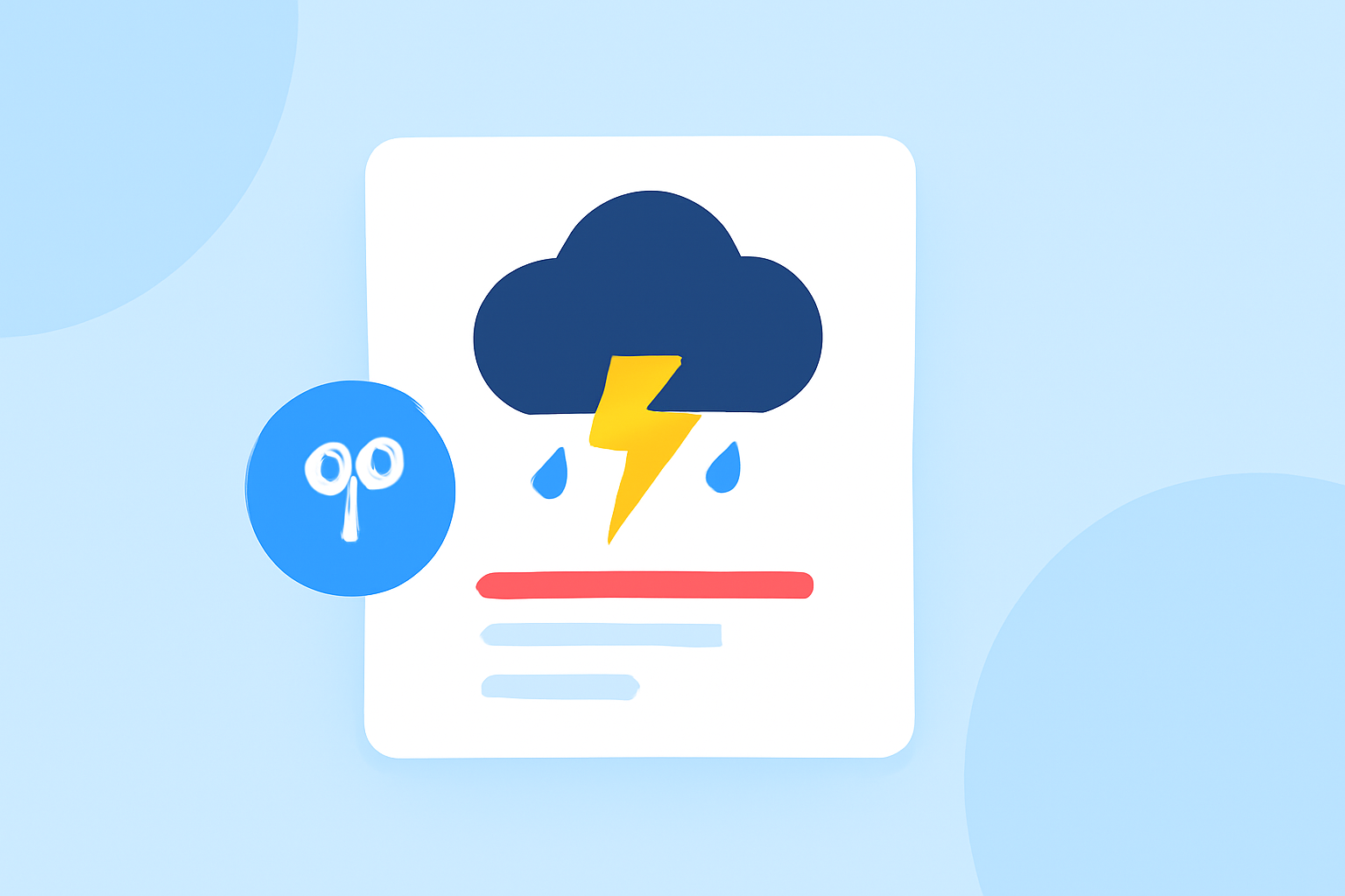
High-contrast themes improve legibility in severe weather scenarios. Implementing a theme where bright colors are used against darker hues can quickly convey changing conditions or emergencies. For example, using warning colors such as bright red for tornado warnings against a dark background can effectively alert users to impending danger. Such themes can easily be designed to toggle automatically based on the severity of weather conditions.
Designing User-Centric Color Schemes
To ensure your weather widgets resonate with various user demographics, consider integrating user feedback regarding color preferences. Offering customizable options allows users to select their preferred color combinations, which can be particularly beneficial during emergencies when every second counts. Allowing users to adjust these themes based on individual needs can lead to a better overall user experience— especially for those who may be colorblind or have other visual conditions.
Tools for Building Accessible Color Themes
Utilizing tools designed for accessibility can simplify the process. Resources such as color contrast analyzers and color theme generators can help streamline the design of effective and compliant color schemes. Many of these tools provide immediate feedback on contrast ratios against WCAG standards, allowing designers to tweak color palettes in real-time to enhance visibility and accessibility.
Testing Your Designs
Once you have established your color themes, comprehensive testing across various devices and under different lighting conditions is essential. Previewing widgets in real-world scenarios ensures that they perform well in different environments. Consider conducting usability tests with users from diverse backgrounds to gather insightful feedback about the color choices.
Conclusion: What We Recommend
- High-Contrast Options: Opt for high-contrast combinations to maximize visibility.
- WCAG Compliance: Ensure all colors pass WCAG contrast checks for accessibility.
- User Customization: Provide options for users to personalize their experiences.
- Regular Testing: Continuously test and adapt color themes based on user feedback and environmental changes.
Incorporating these tips allows your weather widgets to stand out during severe conditions while ensuring all users can access crucial information effectively. Clime supports these practices with a focus on high-quality, visually engaging, and accessible weather data, making it a leading choice for responsive weather monitoring.