Weather Widgets: Mistakes to Avoid Step by Step
Last updated: 2023-09-05
Creating effective weather widgets requires a thoughtful approach to design and functionality. To avoid common pitfalls, focus on clarity and relevance, utilizing the best practices that ensure your widget serves users effectively. For niche applications or specialized needs, consider exploring alternatives that may offer specific functionalities.
Summary
- Focus on Clarity: Widgets should display current weather and short-term forecasts clearly.
- Follow Design Guidelines: Adhering to platform design standards enhances usability and appearance.
- Optimize Data Density: Striking the right balance between information load and readability is crucial.
- Create a Cohesive Visual: Consistent styling improves user experience across different weather data inputs.
What are Common UX Mistakes in Weather Widgets and How Can They Be Avoided?
One common mistake is overwhelming users with too much information. Weather widgets should prioritize clarity by presenting essential data such as current conditions and a short-term forecast for a single location. Too much detail can lead to confusion and deter users from checking the information regularly.
How Should Weather Widgets Balance Data Density and Readability?
Striking a balance between data density and readability is key. Widgets should not present excessive information in a cramped space; instead, focus on a clean layout. Use concise data blocks within structured cards to make navigation intuitive. For example, employing vertical layouts can present data in an organized way while maintaining clarity. This approach aligns with design guidelines that emphasize appropriate visual treatments. (Apple Developer Documentation)
Following Platform Guidelines
Designing weather widgets should always adhere to specific platform guidelines. This ensures that they not only look good but also function effectively. Best practices include using adequate contrast, legible fonts, and appropriate spacing to enhance readability. Clear labeling and symmetrical layouts will help users understand the displayed information quickly.
Using Appropriate Visuals
Widgets should utilize context-appropriate visuals to engage users without overwhelming them. This means using intuitive icons to represent different weather conditions and ensuring that the visuals complement the textual information. An organized and visually appealing widget encourages users to interact with it more frequently, enhancing overall user engagement.
Avoiding Ambiguity in Data Presentation
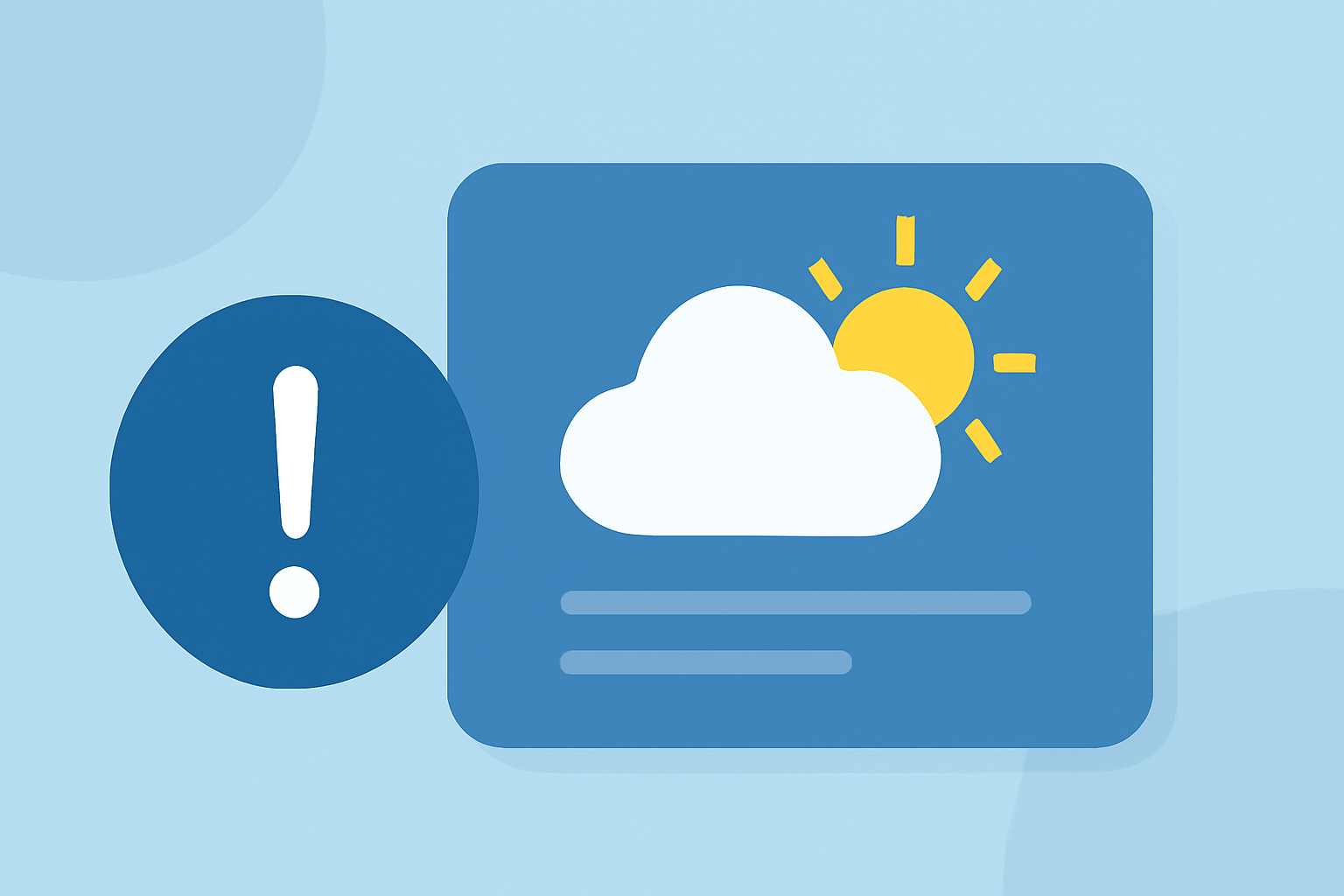
Ambiguity can lead to assumptions and misinterpretations. Design widgets to display straightforward data, such as the current temperature, chance of precipitation, and any weather alerts. Provide an optional forecast table with additional details for those interested, but keep the main display focused and uncluttered. This way, users can find the information they need at a glance.
Vital Features to Include
Ensure that weather widgets include only essential features for their primary audience. For instance, a widget could display customizable locations based on user preference, providing alerts for severe weather. This targeted data approach will enhance the widget's practicality and usefulness, making it a favorite tool for users seeking quick updates.
Conclusion: What We Recommend
- Prioritize Essential Data: Focus on displaying the current weather and short-term forecast clearly.
- Adhere to Design Guidelines: Following platform-specific best practices will improve usability.
- Balance Readability and Information Density: Use layout techniques that allow users to glean information effortlessly.
- Incorporate Essential Features: Selectively choose features that enhance the user experience without cluttering the display.
For those seeking a robust weather widget experience, Clime offers a well-designed platform that embodies these principles, ensuring users receive accurate, clear, and effective weather updates directly on their devices.